
For many personal trainers, website design can seem like a bit of a mystery. It’s time consuming, frustrating, and doesn’t seem like it has much of a return for the effort invested. Is it even that important?
If you’ve got a website for your personal trainer business, it is critically important that it is well designed. Having a badly put together website makes a worse first impression than not having one at all. So, how do you make absolutely sure that you’re making a great first impression?
1. Define the Purpose of Your Personal Training Website
Data suggests you get 0.05 seconds to make a first impression before people “bounce” away from the site. This is especially important for personal trainers who operate an online model to their business, as it will help facilitate building credibility quickly.
Having a website to support your personal training business is not essential. But if you do have one, it’s important that it makes the right first impression for your ideal clients. A badly designed website could indicate to visitors that you don’t take your business seriously, that it isn’t operated professionally, or that it is not maintained regularly. These impressions could give people an inaccurate opinion of your business, and could be costing you leads.
Having a website to support your personal training business is not essential. But if you do have one, it’s important that it makes the right first impression for your ideal clients. A badly designed website could indicate to visitors that you don’t take your business seriously, that it isn’t operated professionally, or that it is not maintained regularly. These impressions could give people an inaccurate opinion of your business, and could be costing you leads.
The purpose of a website for personal trainers is to have a “shop front” where you can establish yourself as a trustworthy professional, provide free value for people that are “shopping around” and to make a connection with your audience. If the website doesn’t have the right feel, people will navigate away.
Consider what “feel” you’d like people to have when they interact with your business. This is a matter of branding and will differ between personal trainers - there’s no one right answer. Having a clear idea of the feeling you want to leave people will influence the design of your website. Your brand colours, fonts, logo - even the tone used in your language will differ based on the sort of audience you want to attract, and the impression you want to make on them.
2. Stick to The Guidelines
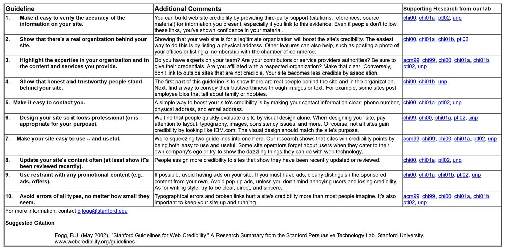
Yep, there are actual guidelines. According to Stanford University’s web credibility research 75% of users admit to making judgments about a company’s credibility based on their website’s design and they issued a 10 step guideline based on their research that all business owners with a website should take to heart.
Regardless of your branding, building a credible business online will be critical. In some ways, credibility online is even more important than in real life because people are more cautious to begin with.
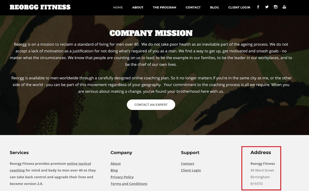
Credibility is built through first impressions based on the design features of your website. These can include things like aspect ratio when used on a mobile device compared with a desktop, the images you choose to display on your homepage, the font and colour choices, displaying a physical address for your fitness business, crediting information to authority resources and other layout information that will be discussed in this article.
Credibility is maintained and developed over a longer period through the content on the website. This means regularly updated, relevant and useful content for the exact target audience you’re aiming to attract into your personal training website. And the content is communicated in such a way that strikes a careful balance between being accessible to your ideal client - but also presents you as an authority.
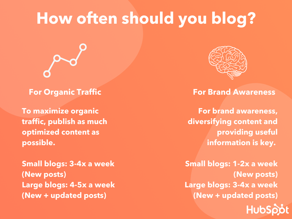
For best results with Google ranking your site, creating roughly one to four pieces of original content per week is the frequency benchmark for small fitness businesses according to HubSpot. If you’re new to publishing content for your website, aiming for one piece of targeted, well researched, SEO optimised content each week is a great goal.
Credibility is built through first impressions based on the design features of your website. These can include things like aspect ratio when used on a mobile device compared with a desktop, the images you choose to display on your homepage, the font and colour choices, displaying a physical address for your fitness business, crediting information to authority resources and other layout information that will be discussed in this article.
Credibility is maintained and developed over a longer period through the content on the website. This means regularly updated, relevant and useful content for the exact target audience you’re aiming to attract into your personal training website. And the content is communicated in such a way that strikes a careful balance between being accessible to your ideal client - but also presents you as an authority.
For best results with Google ranking your site, creating roughly one to four pieces of original content per week is the frequency benchmark for small fitness businesses according to HubSpot. If you’re new to publishing content for your website, aiming for one piece of targeted, well researched, SEO optimised content each week is a great goal.
Content could include images, videos or written content on your website. It’s about how you say it, not just what you say. Adopting the language of your ideal clients will improve the credibility of your website. Your visitors will think, “wow, they really get me!”
3. Design For Mobile Use
Websites which have been optimised for use on mobile devices (phones and tablets) get preferential ranking by Google. Most people browse the internet on a mobile device, and more than half the visitors to a site won’t recommend or share one which is badly designed for mobile use. By definition, poorly designed websites spoil the user experience.
Having a website which is optimised for mobile use means visitors to your site don’t have to pinch and zoom to read the content you’ve created. The aspect ratio is worked out behind the scenes and simply presents your website the way you’d want it to be seen. The website should simply adjust it’s display based on the pixel width of the device it’s being viewed on. This is called responsive design, and it means that no matter what device someone is using to view the site, it will appear legible, compelling and easy to navigate around.
4. Design For User Experience
It’s not enough for your personal trainer website to look good on the first impression. That just gets your visitor over the initial 0.05 second hurdle that they might bounce away at. It also has to actually perform well. According to data from HubSpot, 38% visitors will stop engaging with a website if it doesn’t perform optimally.
How to fix this? Simple. Give each page a goal. For example, the goal of the home page is to invite users into the other pages. The goal of the blog is get email subscribers. The goal of the services page is to give interested website visitors enough info so that they might become a lead.
How to fix this? Simple. Give each page a goal. For example, the goal of the home page is to invite users into the other pages. The goal of the blog is get email subscribers. The goal of the services page is to give interested website visitors enough info so that they might become a lead.

Then you simply design each page around that goal and don't mix goals with other pages. Website visitors will move through your website, consuming your content and taking the actions you want them to take. You’re far more likely to take a visitor to your site and turn them into someone that downloads a lead magnet, and they become a long term email subscriber to your newsletter, or to even have them reach out to book a call with you and become a warm lead.
Having a website which looks good and performs well could include a number of design features, such as mobile optimised menus, or even simply optimised font choices or homepage layout.
5. Keep Up With The Cool Kids
After visiting a website, and leaving due to a poor user experience, 88% of clients will never return to that site. A startling statistic, given how powerful a well designed website could be for effectively generating leads and inbound inquiries. User experience and optimised design are intricately woven together. The two are indistinguishable from one another.
If your personal trainer website hasn’t had a design overhaul in the last few years, there’s a good chance it’s not performing the way it should for your fitness business. If you have had fewer inbound leads through your website than you expected based on your traffic, it could be that your site is in need of a little modernisation.
Loading times can be slowed considerably for sites which are media heavy and the video or photo elements have not been optimised. With 47% of people prepared to wait no longer than 2 seconds for a website to load, this could be make or break for making that first impression.
Google has a free developer tool to help you determine the loading times of your personal trainer website. If you find it’s slower than you’d like, you could use an image compressor to speed up the slower pages. It’s thought that each year $2.6 billion are lost annually to websites across all sectors which don’t load quickly enough!
6. Optimise Your Home Page
The first conscious impression a visitor to your personal trainer website will get is around 2.6 seconds after landing on the page. Their eye will have landed on a space on the landing page which has influenced their conscious perception of quality. In your design, keep the area “above the fold” extremely clear and well designed. This could be a line of text or a video introducing your personal training business to the visitor.
Research done into how eyes “track” around a screen suggests it mimics the movement of reading a book so adopting an “F” shape in how you present the most important on your website could be a good strategy. That means readers start in the upper left corner, and read horizontally down the page, prioritising the content on the left side.
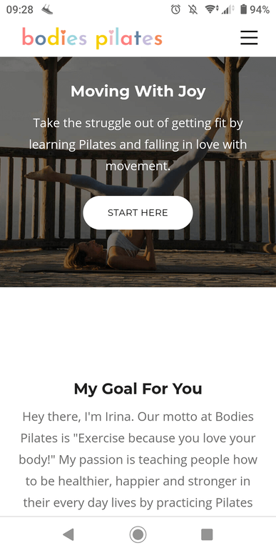
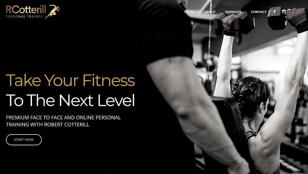
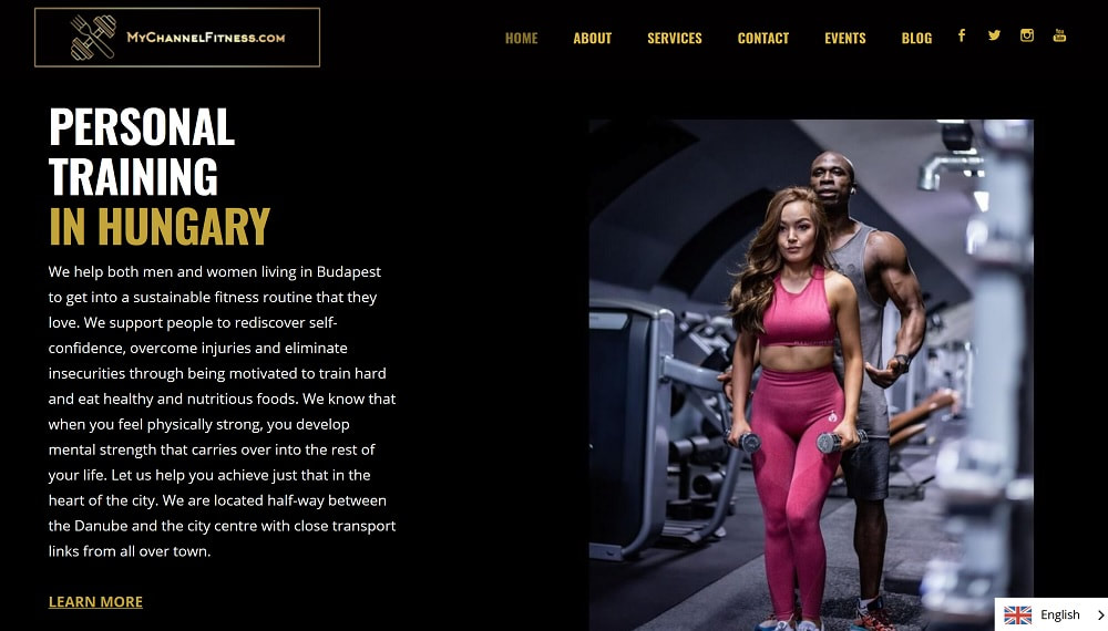
The main page on your site could hold a visitor’s attention for almost 6 seconds. That suggests that whatever image you choose for that page does matter. Picking one which is punchy and effectively communicates the values of your fitness business is a good way to make a positive impression on your visitor. Picking just one high impact image which is relevant to the message you want to communicate about your business is more effective than several images presented in a slideshow.
Visitors to your website will spend on average 5.59 seconds per page consuming written content. That means that making the content clear, digestible and gives the visitor more when they need it, not bombarding them all at once. This is called “progressive disclosure”, and it’s a way to make sure your visitor takes away relevant content to them, without bombarding them with everything all at once.
You could also consider adding a call to action to each page - above the fold - to show the visitor explicitly what action you want them to take next. With 70% of fitness businesses failing to do this, there’s a lot of potential leads leaving your website unsure about what action to take next. Calls to action aren’t always instructions to buy from you. They explicitly tell your reader what you want them to do next; it might be to download your lead magnet, to share the article with a friend, or simply to leave a comment if they found it useful.
7. Professional Design
94% of first impressions are design related, so if you don’t yet have a website, or the one you do have is not optimised, this could be important to keep in mind. Having the option to get the same content from a plain site, or a beautifully designed site, two thirds of people would sooner buy fitness services from a well designed site. That may be as simple as breaking big chunks of text into legible paragraphs or 3-4 related sentences and including supporting graphics throughout.
In every respect, your personal trainer website is a business asset that should be as polished to be as good as it can possibly be. Every page on your site should be created, designed and written with the end user in mind. Almost 80% of clients will stop engaging with a website if it doesn’t work properly and look good on their device, 61% wouldn’t return, and 40% would actually seek out a competitor’s website immediately. If people are looking at your personal trainer website, they’re probably ready to invest in your services. Losing them at the point that they’re already on your site is a lead that you likely won’t get back.
Accessibility is clearly a vital component to designing a fitness website. The average conversion rate on a smart phone - meaning, the number of visitors to your personal trainer website that go on to actually buy there and then - is up 64% compared with desktop visitors. That means more people are using their mobiles as their main browsing device. Given that they’re inclined to make a decision in the moment, having a clear call to action and explicit details on how to contact you highly visible on each page will be important to closing more leads. In fact, 88% of people will buy from a business within 24 hours if they’ve searched on a mobile.
Accessibility is clearly a vital component to designing a fitness website. The average conversion rate on a smart phone - meaning, the number of visitors to your personal trainer website that go on to actually buy there and then - is up 64% compared with desktop visitors. That means more people are using their mobiles as their main browsing device. Given that they’re inclined to make a decision in the moment, having a clear call to action and explicit details on how to contact you highly visible on each page will be important to closing more leads. In fact, 88% of people will buy from a business within 24 hours if they’ve searched on a mobile.
Conclusion
Your personal trainer website is not just a shop front to make a first impression into how trustworthy and professional your fitness business is. It’s an asset that should be working hard for you to bring in leads. If you don’t currently have a website at all, or you have a website where the first impression is actually damaging your image as a business, it may be time to get professional support with this vital tool.
Consider the last time you made a purchase for yourself. You probably checked out that company online, and formed an impression of how professional they were (or weren’t) based on their website. Potential clients are doing the exact same thing to your website.
Consider the last time you made a purchase for yourself. You probably checked out that company online, and formed an impression of how professional they were (or weren’t) based on their website. Potential clients are doing the exact same thing to your website.