Did you know that Google now prioritises “mobile-first indexing”. This means that websites that work well when viewed on a mobile device, responsive fitness website designs, will appear higher in the search results than websites which weren’t optimised for being used on mobile devices.
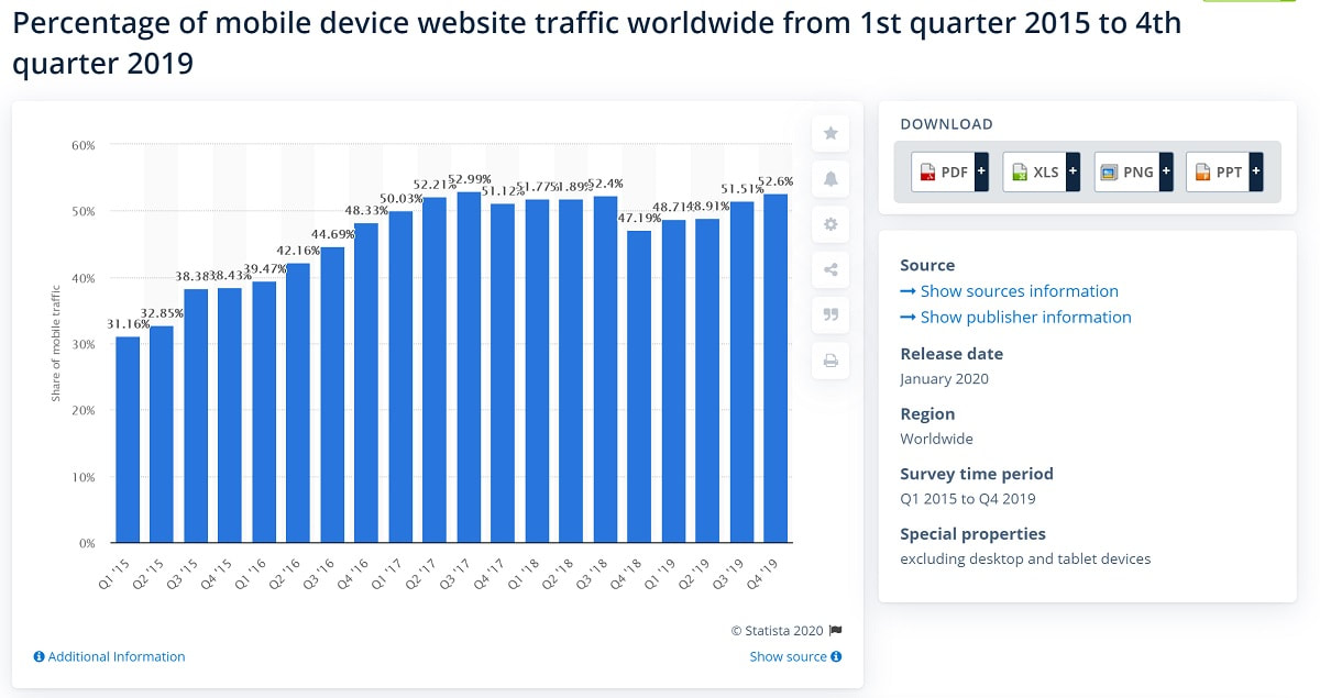
The reason behind this is that more people now search Google on their phones and tablets than on their desktop computers. Statista shows that over 52% of internet traffic comes from mobile devices.
If you have a personal trainer website, here are some things you may want to consider to ensure that your website is optimised for mobile browsing.
What Is Responsive Design?
A responsive website means that it's mobile-friendly. That the elements of your website, such as images and menu navigation still look good and function properly on a mobile device.
There are some factors which indicate that your site is not responsive. If you visit your personal trainer website on your smartphone or tablet and:
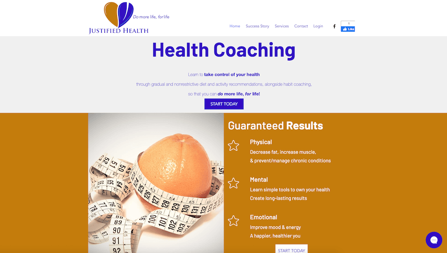
Here's an example of how that might look.
As you can see, the desktop site is fully legible and everything is on screen. But the mobile version of the site is cut off. Not good.
There are some factors which indicate that your site is not responsive. If you visit your personal trainer website on your smartphone or tablet and:
- The font is too small and hard to read
- You have to zoom around to see the screen, especially on forms
- You can’t see the full navigation bar
- Images are out of alignment, taking up too much space
- You’re able to scroll from left to right on a page
Here's an example of how that might look.
As you can see, the desktop site is fully legible and everything is on screen. But the mobile version of the site is cut off. Not good.
These issues would indicate to Google and your website visitor that your fitness website is unresponsive. This not only has a negative impact on the experience for potential clients but Google will almost certainly penalise your site and be less likely to show your site to potential leads.
This could make it harder for someone that’s interested in your personal training services to find your website on Google.
To improve the experience a potential client has when browsing your personal trainer website, you might consider the following changes:
- Sections of text adjust to fit the screen
- You don’t have to pinch and zoom to read around the screen or complete application forms
- Design elements are easy to digest and don’t throw other parts of the page out of alignment
- Navigation bars are compact and can be expanded to see more options
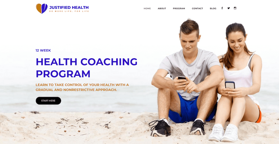
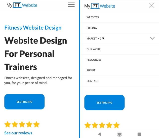
Now here's that very same site by redesigned by our team and responsive:
In short, navigating around your personal trainer website should be the same experience for a visitor regardless of their browsing device. Visitors who are able to navigate your website easily are more likely to stay on the site longer. They are also more likely to hire you for personal training services.
1. Check How Responsive Your Site Is
Your website might already be responsive and provide an excellent user experience. If you aren’t sure, you can check by using Google’s own online responsiveness tool.
This will analyse your website and produce a clear answer on whether your website is in need of attention. You can see how your website looks on a variety of devices using Am I Responsive? which generates a visual representation of your website across a number of devices.
By seeing your website the way your visitors and potential clients would, you can spot the elements which are responsive and those which aren’t. This assessment is the first step to fixing the problems. People often pay particular attention to:
- Navigation bar & menus
- Fonts
- Images
- Forms
- Buttons
2. Run A Site Speed Test
People are impatient when waiting for a website to load, especially on their mobile device. If they have to wait too long, they might click away from your website. A slow website might be because:
Google also offers a tool to assess your page speed.
- Your images are too big. Condensing them is free at tinypng.
- Site elements are not responsive.
- Cluttered code.
- Big files, such as video.
Google also offers a tool to assess your page speed.
3. Finger Taps
Designing the elements on your personal trainer website is slightly different when you work with mobile devices in mind. On a phone, visitors are navigating your website with their fingers and thumbs.
On a tablet, it’s possible they’re using a stylus. You might want to consider the user’s ease of navigation in relation to:
On a tablet, it’s possible they’re using a stylus. You might want to consider the user’s ease of navigation in relation to:
- The size of the buttons
- How big the boxes are on forms
- The navigation bar and menu expansion
4. Testing Navigation
Navigation on a desktop website might span the top of the page. On a mobile, this should be compressed for ease of use. Most commonly, the three horizontal lines known as a “hamburger” will expand when tapped for more options. Sometimes, the menu is truncated on mobile devices so that options are all visible and nothing gets cut off.
This is an important element of your personal trainer website because visitors to the site will use it to find exactly what they want. If your visitors are trying to book your services and your navigation makes that impossible, they will likely “bounce” from your page, and not return. The role of clear navigation is to make it as easy as possible for people to find what they’re looking for on your website.
5. Pop-Ups
Pop-ups on your website will be triggered when visitors do a particular action. Often they will be generated if the visitor tries to navigate away from the site. The pop-ups on your personal trainer website should be responsive too.
That means whenever the visitor has done the action which triggers the pop-up, it shouldn’t obscure what you want them to do on that page. If your pop up makes it hard to click off it or makes it impossible to enter their details in your sign up form, the visitor will get frustrated and click away. This could not only stop them from booking you for personal training but will also stop them from doing any number of other valuable tasks, such as signing up to your newsletter, downloading your lead magnet, or reading your article.
Making sure your website looks great for your visitors will really improve their experience.
- Images should be relative to screen size
- Menus are visible and easy to navigate
- Lists are formatted easily and fonts are readable
- Forms and tables are easy to fill in and look neat
Next Steps
Auditing your personal trainer website as though you’re a visitor, you might choose to check:
Having a website is a crucial component of an online fitness business. With more people browsing on their phones than on a desktop, your personal training website will be indexed more highly if it meets these responsive design elements.
- Can you submit a form across all devices?
- Can you navigate to every part of the site easily?
- Do your links all work?
- Is each page working as it should, including your blog?
- If visitors can make a purchase on your site, is the checkout process simple?
Having a website is a crucial component of an online fitness business. With more people browsing on their phones than on a desktop, your personal training website will be indexed more highly if it meets these responsive design elements.

