The home page on your fitness website is one of the most visited pages on your website. People will find it on Google, on social media and via your blog page when you publish new and valuable content.
But deciding what to put where on your home page can be both frustrating and time consuming.
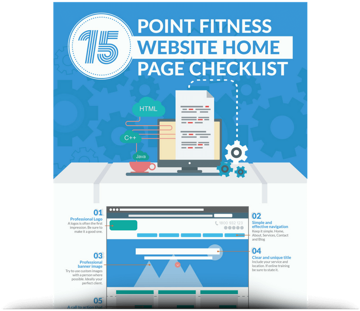
So we've created a 15 point fitness website home page checklist that we use for our Managed Website clients to ensure they get the best possible results for their home page.
You can download the compete checklist and get weekly marketing updates here.
1. Professional Logo
A professional logo is often the first thing a new website visitor will see. User Experience (UX) research show the people typically scan a website in an F shape. Starting at the top left, scanning the navigation and then working their way down a page.
With the rise in responsive website, logos are usually placed at the top left of a page in the navigation. Make sure yours is professional, simple and memorable.
2. Simple & Effective Navigation
If you're looking for a building in a big city, the last thing you need is a complex map. Your website visitors feel the same way.
An easy to use navigation menu that clearly displays what the website visitor would expect to see on each page not only makes for a pleasant experience but also keeps people on your website for longer.
An easy to use navigation menu that clearly displays what the website visitor would expect to see on each page not only makes for a pleasant experience but also keeps people on your website for longer.
We like to use Home, About, Services, Contact and Blog pages at a minimum to make sure the website visitors of your personal trainer website can easily find what they're looking for.
3. Professional Banner Image
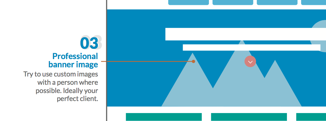
The image for your main header serves multiple roles. It acts as a wow factor when a website visitor lands on your home page while also helping that person understand where they are.
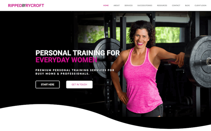
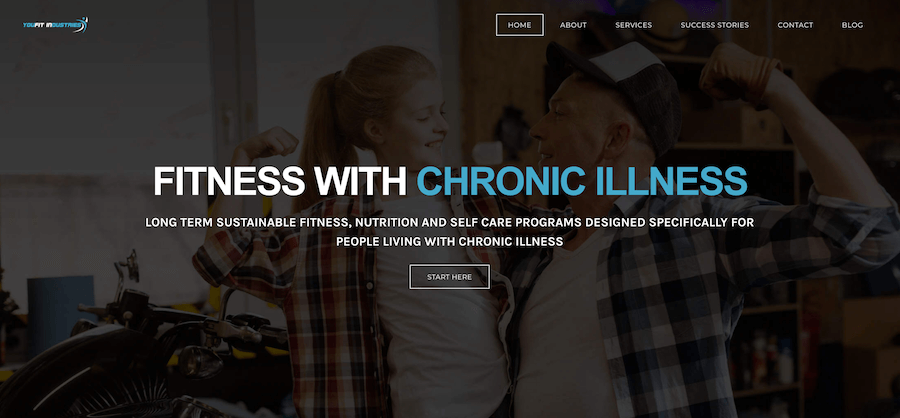
For example, if you're a personal trainer and your banner image is of someone receiving a massage, that's going to be a bit confusing. Pick an image that's large, shows what you do and looks good. To make way for your main headline text, you can darken areas to the left like this:
Or you can contrast the image with the text like this:
This works with both dark text on a light background and light text on a darker background.
4. Clear & Unique Title
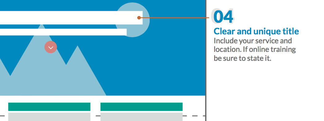
Your page title offers new website visitors an instant overview of what you do and the kind of company you are.
Using words that include your service and location are ideal. Using words that include your service, location and ideal clients is better.
Using words that include your service and location are ideal. Using words that include your service, location and ideal clients is better.
For example:
- "Personal Training" Vs
- "Personal Training in London" Vs
- "Personal Training in London for Busy Entrepreneurs"
And remember, calling yourself anything other than what your clients are looking for might cost you leads. Every week I see personal trainers calling themselves a movement therapist or hypertrophy coach.
If the client is looking for a personal trainer, call yourself one. You can wow them with your hypertrophy training after you've established some rapport.
5. A Call to Action
A Call to Action (CTA) asks website visitors to take a next step on your website. A lot of trainers make the mistake of asking the new website visitor for an email or to pay money.
This can be frustrating to the website visitor when they're looking for your services and pricing.
This can be frustrating to the website visitor when they're looking for your services and pricing.
Invite the readers to take their next logical step. What would they want to do next? What do they need to see before they get in touch and become a lead? Get this right and your website visitors will stick around for longer and maybe even get in touch.
6. Above the Fold Image
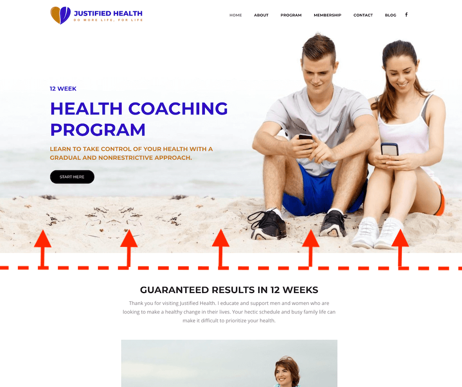
The above the fold area on your website is the part of the website the user can see BEFORE they start scrolling.
When someone lands on your personal trainer website home page, the last thing you want them to do is click the back button.
When someone lands on your personal trainer website home page, the last thing you want them to do is click the back button.
A well placed image or video partially above the fold can help encourage new website visitors to scroll down a little further and check out more of your website.
7. Featured in or Partner Logos
Getting your site featured on a well known company website can help to boost your reputation and online profile. It also gives website visitors that extra element of trust because if a well known brand trusts you, they can too.
If you don't have any featured in or partner logos yet, consider writing for some well known company blogs and partnering with supplement companies.
8. Clearly Defined Services
What are you website visitors there for. Personal training, a summer challenge or a block of sessions?
Having clearly defined services on your home page can help the website visitor move from the home page to the inner pages of your website.
Having clearly defined services on your home page can help the website visitor move from the home page to the inner pages of your website.
If you offer 2-3 services, consider writing a short intro about each of them and then linking to their respective pages.
9. Testimonials
Testimonials are the backbone of your marketing strategy. Video testimonials hold a lot more power than any other medium but you need to get them in any format you can. Even plain text testimonials are better than nothing.
A great way to boost the look of your plain text testimonials is to add a head shot and a 5 star image to them. Putting a face to the name and a star rating will encourage people to read more and trust the testimonials are real.
10. A Call to Action
Yep, another call to action. But this one is specific to the services we've just been talking about and adding testimonials for.
After the website visitor has identified that you do in fact provide the service they're looking for and they've seen proof you can do what you say you can do in the form of a testimonial, their next logical step is to find out more about the service.
11. Low Barrier Offer
Some people are going to be in a rush. After seeing that you offer what they think they need, they may just want a reason to get started. This is where a low barrier offer comes in.
The low barrier offer could be something you'd offer a potential new client anyway. Like a free strategy call or consultation. Make it something easy and simple to act on there and then.
12. Your Company Story
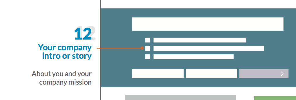
This is a great way to link to your about page so that website visitors can find out more about you and connect with you as a person.
For our fitness website design clients, we like to use a Company Mission or Mission Statement. It packs a bit more power while leaving plenty to talk about on the About page.
13. Professional Photo
A professional photo goes a long way to helping website visitors connect with the face of the company. And we're in a time where people prefer to buy off people, not corporations.
Add a pro photo of yourself or your team looking smart. Arms folded, smile and use a blank background if your gym setting looks a bit messy.
14. Lead Magnet
Most people add a lead magnet at the top of the page. Hoping that the more people who see it, the more subscribers they'll get.
While that does make sense, it doesn't necessarily get you more quality leads. Nor does it help new website visitors find what they're looking for.
While that does make sense, it doesn't necessarily get you more quality leads. Nor does it help new website visitors find what they're looking for.
For example, which lead you think would hold more value? One that randomly signed up to a trainers email list that they'd never met before, or a lead that had gotten to know about you and the company first.
15. Footer Navigation
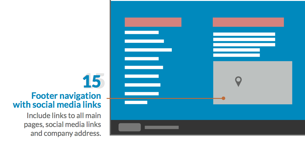
The footer navigation helps people who are at the bottom of your site find pages they might be looking for while at the same time helping Google index the pages of your website.
Don't forget to include your terms of service, privacy policy, address and social media links.
With the 15 point checklist, you'll have no problem creating the perfect fitness website design for your home page.

