
Your personal trainer website is the “face” of your fitness business online. While you will want your personality and individual values to come across to your visitors, you will want to present your personal training business in a way which is effective and compelling.
In this article, we'll dig into 5 ways to make your fitness website look (and feel) professional.
1. Homepage Design
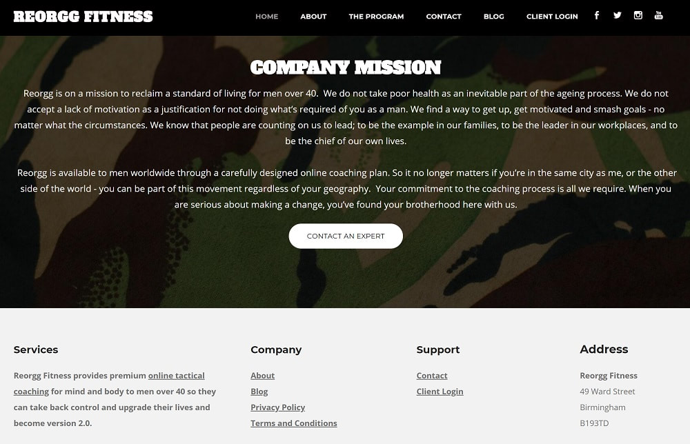
The “homepage” is the main page of your personal trainer website and the main indexed page from which all the action happens on your site. It will probably be the first page your visitor sees when you direct them to your website. The main message your homepage should communicate to a visitor is your core message: what is your service, who you serve, how and why.
With most internet users having rapidly decreasing attention spans, it’s unlikely that your website visitors will read every single word you write. It’s more likely that visitors will scan through the page, selectively focusing on key images or headline content. Appealing to a visitor’s emotions in this way, making sure the critical information isn’t hidden behind anything they would have to click on or scroll to, helps your homepage to have maximum impact.
Designing your homepage to have this impact will make it more likely that your audience will take the actions that you want them to. Here are some practical tips:
- “Above the fold” for important information. This term means anything that visible without scrolling down the page. So just from the page loading, the visitor understands what your site is all about.
- Whitespace. This is a design term that means leaving some parts of the site blank, and not overcrowding the screen with loads of text or images. It gives a spacious feel and will make the text you’ve included more easily legible.
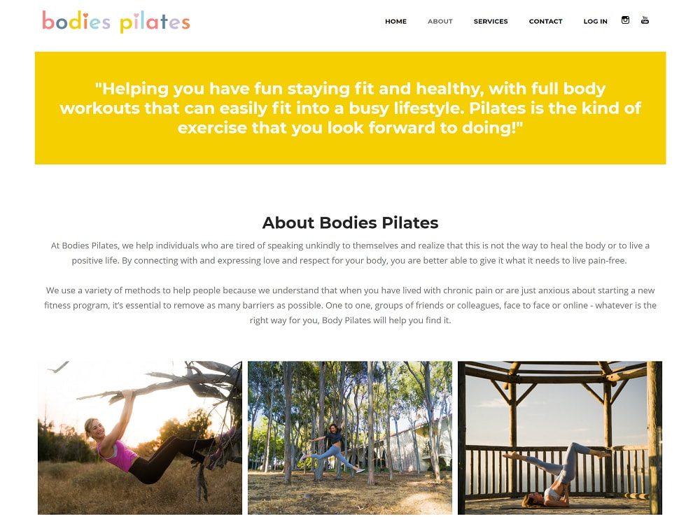
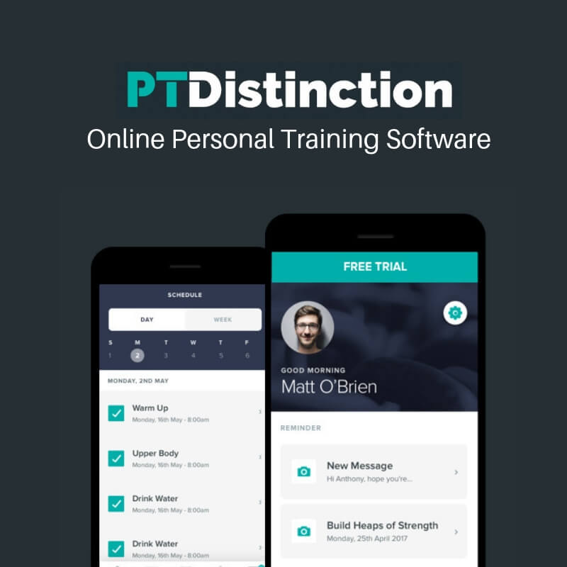
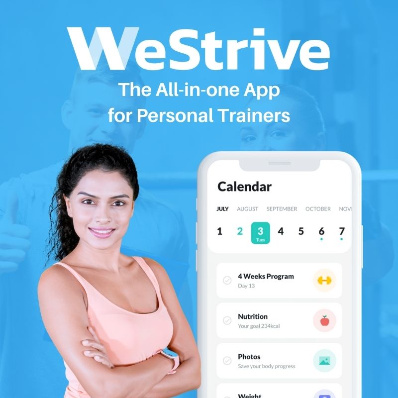
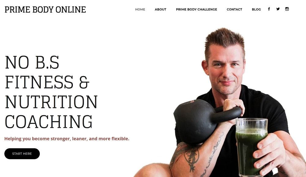
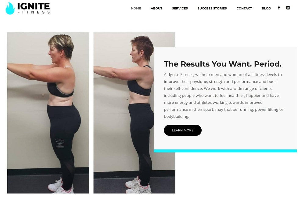
- Compelling imagery can communicate your message at a glance. High quality, professional images, such as photographs of you working with your clients in the gym, is an effective way to build rapport with your visitors and help them to understand what you do.
- Include one call to action above the fold. A CTA is any action you want your visitor to take. That might be an invitation to check out your personal training service packages if they are interested right from looking at the header. Including one CTA provides your visitor with a clear next step.
2. Visual Hierarchy
Hierarchy is one of a handful of design principles that are clever when it comes to designing a personal trainer website. Hierarchy is about taking the most important stuff on that page and presenting it first.
Understanding what the most important “thing” is on the page will allow you to direct the visitor’s attention to it, ahead of the less critical information.
Once you’ve decided which are the essential elements on that page, it will be easier to direct your visitor to them in the sequence you want through thoughtful design elements.
Understanding what the most important “thing” is on the page will allow you to direct the visitor’s attention to it, ahead of the less critical information.
- Size and weight of the business name, logo, and any titles on that page will make it easy for a visitor to skim read the page and decide what they’d like to read in more detail.
- Placement of the essential elements on the page towards the top left will draw your visitor to read your content in a sort of “Z” shape (perfect when there’s not much written content to digest), with the least important elements towards the centre of the page. An “F shape” (including an image, headline and sub-headline) may be better when the website has a lot of written content.
Once you’ve decided which are the essential elements on that page, it will be easier to direct your visitor to them in the sequence you want through thoughtful design elements.
3. Readable Content
Usually, websites aren’t read like books - every word from top to bottom. Instead, visitors to a website are likely to skim read, looking for specific relevant content. Making it easy for people to pick out words, sentences and phrases from your page will make it more readable, and people will be more able to take in the information.
There are three main ways that you can make your personal trainer website more readable.
There are three main ways that you can make your personal trainer website more readable.
- Increase the contrast between your font colour and your background colour. This is important for all website users for eye comfort but especially crucial for those visitors with visual impairments. Contrast Checker is a free tool to check your contrast level.
- Font size will depend on which font you choose, but a good rule of thumb is 16pt for body text. This will make most fonts readable, but don’t be afraid to go bigger if you need to for clarity.
- Font choice is split into two camps; serif and sans serif. A serif is a little flourish on the letters themselves, and while this looks great for a heading, body text is usually more easily read when sans serif. Don’t use too many font combinations, stick with two or three to make the design of your website consistent.
4. Easy Navigation
Making it easy for your visitors to find their way around on your website is essential, and there are a couple of simple ways to improve the navigation around the site.
- Link your logo to the homepage. The brand logo or your business name could link back to the main homepage of the website. This is something that feels familiar and expected by web users.
- Menu navigation should be prominently available on every page, either as a drop-down hamburger option or as a horizontal navigation bar.
- Long pages that require a lot of scrolling can benefit from anchor navigation which allows the visitor to jump to specific sections on the page. Relatedly, a “back to top” anchor can help people jump up and down a long page quickly.
- Footer information should link to contact information and social media links to allow people to connect with you in another format.
5. Mobile Friendly
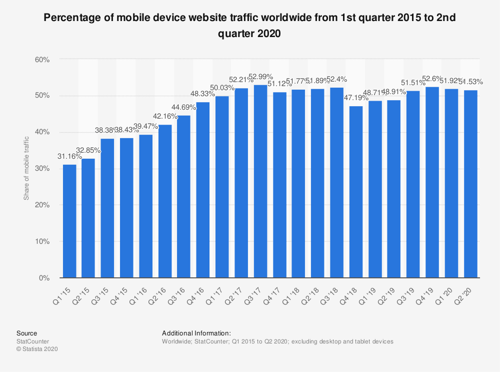
More than half of web browsing is now done on a mobile device, so using your website as a visitor would - and browsing through your mobile device - will help you to see your pages just like a potential client would.
Ensuring your site is clean and uncluttered not only makes it more user friendly, but it also improves the chances that you’ll rank on Google as the search engine prioritises websites which are designed with mobile use in mind.
If you need some help designing your website yourself, we offer a done for you service where these elements are all optimised as part of the design process.
If you need some help designing your website yourself, we offer a done for you service where these elements are all optimised as part of the design process.