Ever wondered why companies use the same colors on their business premises, website, logo, and other branding materials?
It’s because colors influence the consumer’s decision-making process and brand recognition. According to Pantone Color Institute, "color is a critical element of the design process, increasing brand recognition by 87% and influencing up to 85% of product purchases".
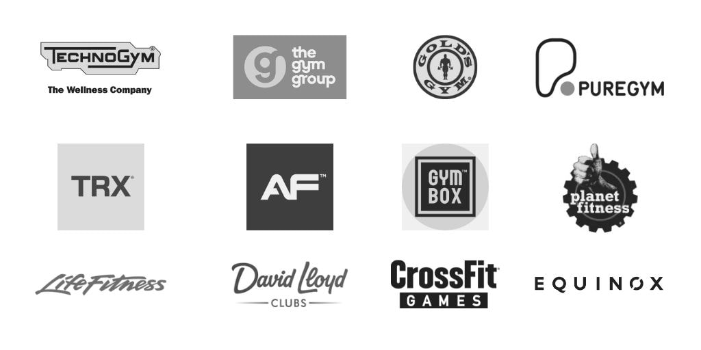
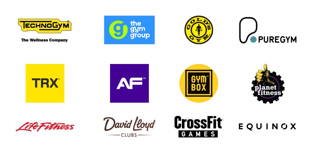
If you look at the grey-scaled logos of well known fitness brands, can you tell what their main brand color is?
I bet you can and that's not by chance. A brand's color palette is crucial for the brand strategy of a business.
The same way, the colors you use on your personal training website can grab your prospects’ attention so they decide to engage with your services. Or push them away without even knowing what you’re about.
To ensure your site evokes a positive response from potential customers, you must choose brand colors that reflect your brand’s personality and resonate with your target audience. There’s a science to creating a brand color palette perfect for your fitness website. Learn the formula below.
How To Choose Your Fitness Brand Colors
The secret to choosing the right brand colors for your personal training website is to blend color psychology with branding and marketing principles. This way, you can create color combinations that’ll attract your target audience and convert them into loyal customers.
To choose your fitness brand colors, follow this step-by-step process:
To choose your fitness brand colors, follow this step-by-step process:
1. Define Your Brand Personality
Defining your brand personality sets the tone for choosing brand colors that make your brand memorable and relatable to your target audience. This involves identifying characteristics or traits that represent your brand’s overall vibe.
It also involves knowing your brand’s voice (how you convey your brand’s core message) so you can pick the right colors to match.
To define your brand personality, consider your brand’s values and target audience, then answer the following questions:
It also involves knowing your brand’s voice (how you convey your brand’s core message) so you can pick the right colors to match.
To define your brand personality, consider your brand’s values and target audience, then answer the following questions:
- How would you describe your brand in three words?
- What would you like potential customers to feel when engaging with your brand?
Answering these questions will narrow down your color choices significantly.
Say you’re targeting a youthful audience, and your fitness brand’s main keywords are dynamic, energetic, and outgoing. You’ll want your prospects to feel excited and upbeat when they engage with your brand, right? Your brand palette should, therefore, consist of bold, cheerful colors.
Another personal trainer targeting a mature audience may describe their brand as sophisticated, calming, and trustworthy. They may want prospects to feel peaceful and relaxed. In this case, cool, soft pastels could be a better choice.
2. Learn The Psychology Of Colors
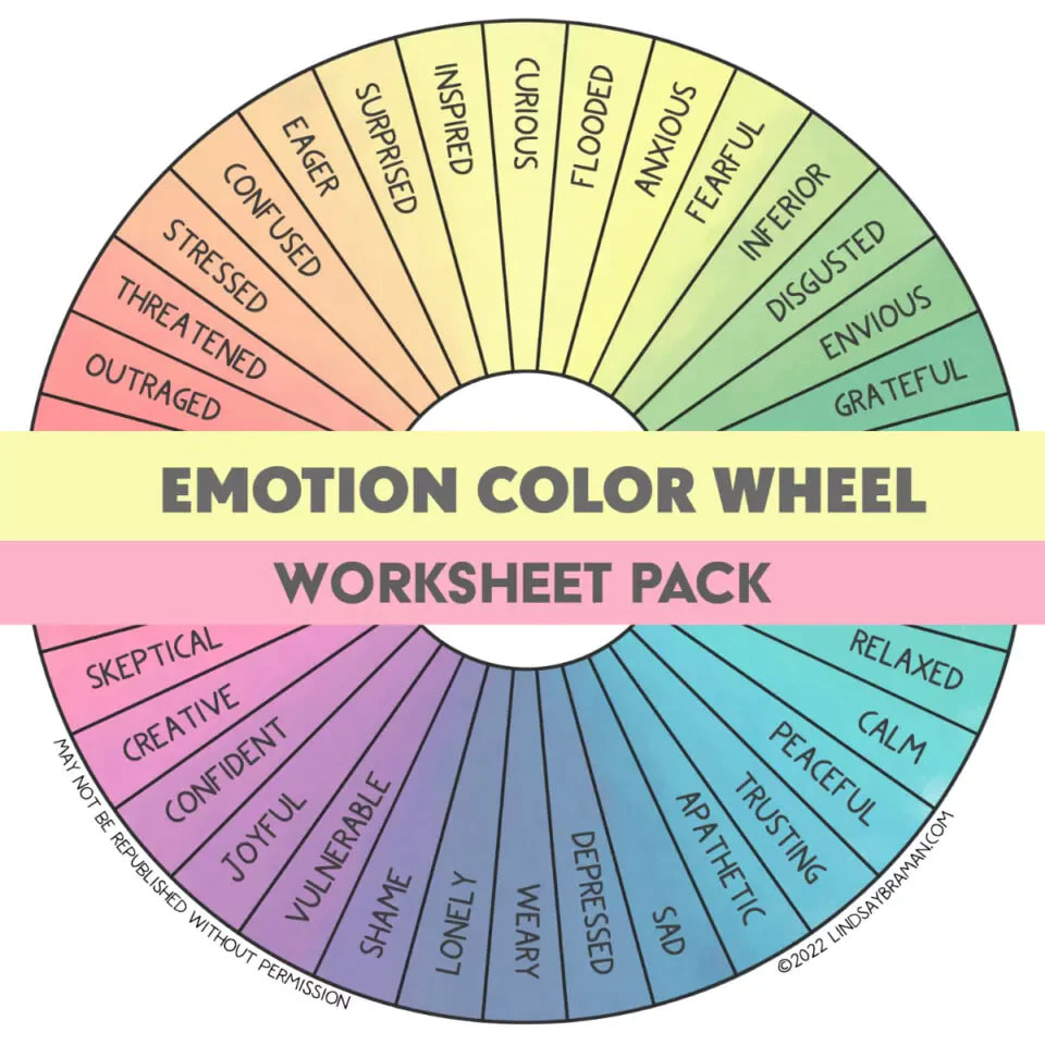
Color psychology involves studying how colors affect people’s emotions, perceptions, and behaviors. In business branding and marketing, this field focuses on how different colors affect consumers’ impressions of a particular brand. Do certain colors or color schemes persuade consumers to consider specific brands more than others?
Learning the meanings behind different branding colors after you’ve defined your brand personality helps you create a color palette suitable for your specific fitness venture.
Settle on your site’s primary colors to evoke certain emotions in your prospects. Then, pick additional secondary colors to make the site more appealing.
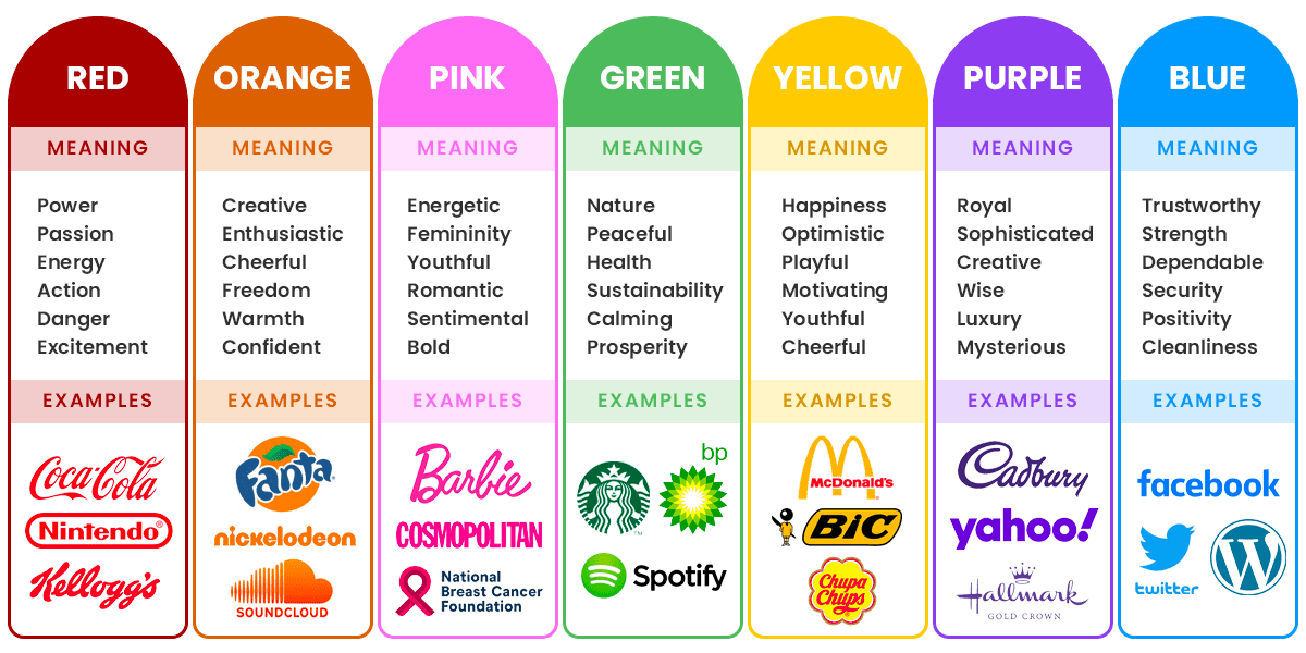
Different colors may have different meanings in various regions and cultures. But there are some universally accepted meanings for most common colors, including:
- Red – excitement, love, passion, anger, danger
- Yellow – happiness, optimism, youthfulness, creativity
- Orange – joy, playfulness, vitality, friendliness, energetic
- Green – nature, growth, freshness, prosperity, stability
- Blue – light blue exudes loyalty, calmness, honesty, trust, and openness, while dark blue exudes professionalism, security, and formality.
- Purple – royalty, creativity, luxury, mystery
- Pink – youthfulness, innocence
- Brown – rugged, earthy, solid, and grounding
- Gray – a neutral color signifying sophistication, elegance, and seriousness
- White – safe, clean, innocent, virtuous, simplicity
- Black – power, strength, edgy, luxurious, modern
Different shades and hues of a certain color also create different effects. They may add to or distort their original meaning. For example, too much yellow can cause anxiety.
You may want to familiarize yourself with the basics of color theory to combine colors correctly and create an effective brand color scheme for your website.
3. Research Competitors
Most personal trainers skip this step when creating color pallets for their fitness websites, but you shouldn’t. Researching the top-performing brands in your niche is essential for two reasons:
It'll be important to check trainers in your geographic area as well as area of expertise to come to some conclusions. However, you can already get some ideas about why big brands are choosing specific colors by checking out those big brands we looked at in greyscale earlier:
- You’ll know what brand colors already appeal to your potential customers and which ones are not a good fit so you can avoid them.
- You can work around what’s already working to create a unique site that stands out from your competition. You may have to play around with several brand color codes to identify unique color combinations for your niche.
It'll be important to check trainers in your geographic area as well as area of expertise to come to some conclusions. However, you can already get some ideas about why big brands are choosing specific colors by checking out those big brands we looked at in greyscale earlier:
4. Create Your Brand Palette
Your brand color palette can have one to five colors, depending on the color scheme you go for. There are four primary color schemes you can work with to create different color combinations for your personal training website:
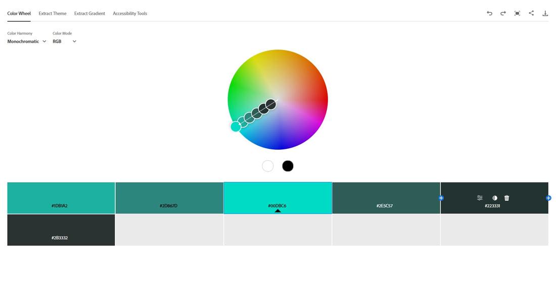
Monochromatic – a monochromatic color scheme involves using one color in many shades. This is a good choice when you have one dominant personality trait you want to focus on throughout your website and business branding. Make sure to differentiate the hues and shades you choose to avoid ending up with a visually stunted look.
Monochromatic – a monochromatic color scheme involves using one color in many shades. This is a good choice when you have one dominant personality trait you want to focus on throughout your website and business branding. Make sure to differentiate the hues and shades you choose to avoid ending up with a visually stunted look.
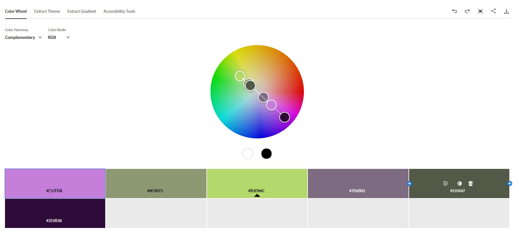
Complementary – a complementary color scheme uses colors directly opposite each other on the color wheel. Because these colors are a sharp contrast, they pair well and are perfect for dynamic, stimulating visuals.
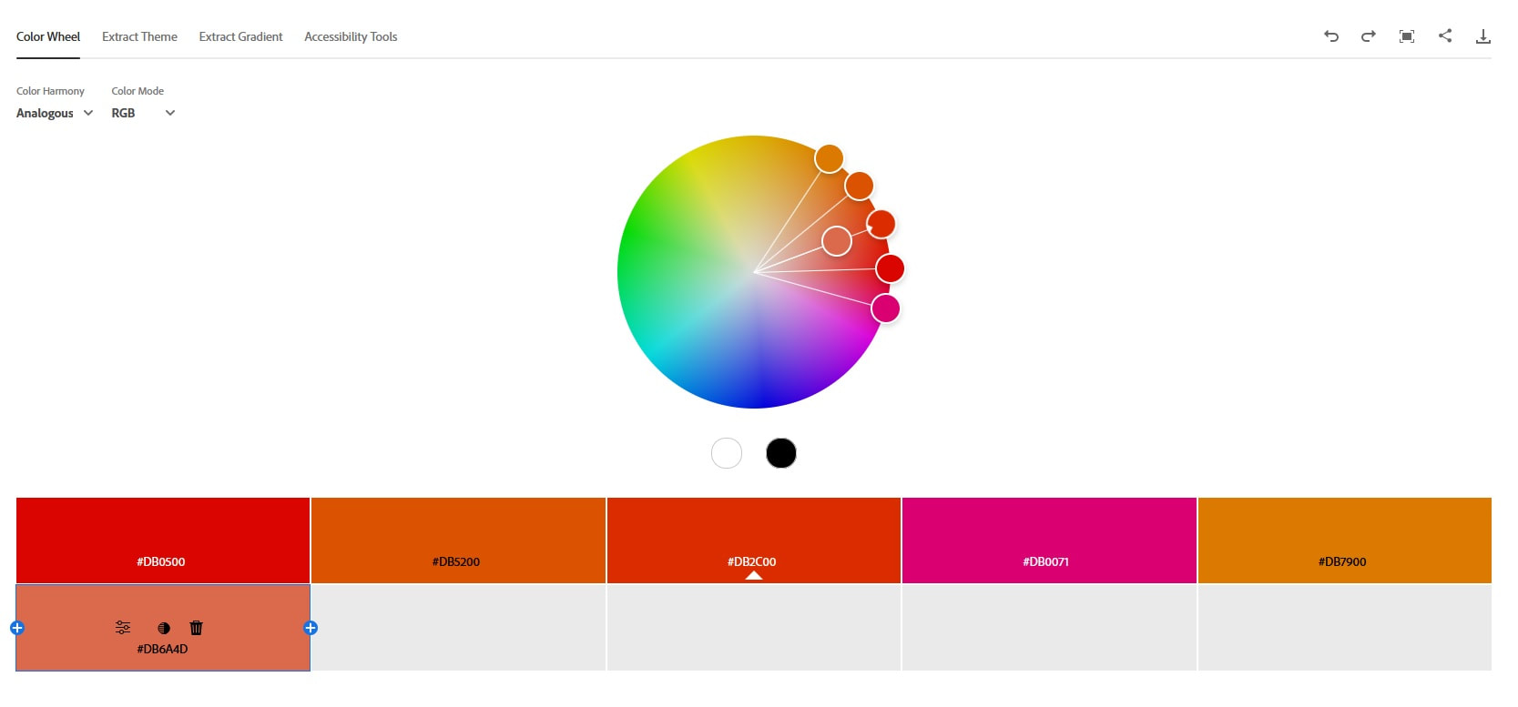
Analogous – an analogous mix uses a few colors close to one another on a color wheel. They create a sense of harmony since adjacent colors often have almost the same emotional connotations. These schemes are safe bets and may not be the best choice if you want your fitness website to stand out or draw attention.
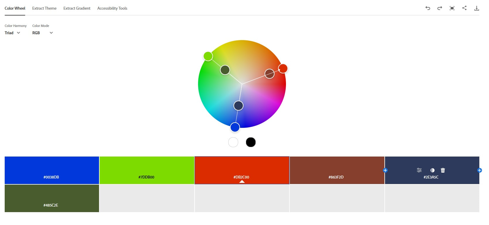
Triadic – a triadic color scheme uses colors forming a triangle on a color wheel. It’s a stable brand color scheme, like an analogous scheme, but offers a more stimulating effect, like complementary schemes. Identifying three colors to match your brand identity traits from three different sections of the color wheel might be challenging. But it’s worth the effort.
Formula For Creating Your Fitness Brand Color Palette
Now that you know the various color schemes you can use, here’s a simple formula for creating an effective brand color palette:
Choose Your Base Or Primary Color
Pick a color you love that also represents your brand’s mission. It must be a memorable color to grab your audience’s attention and highlight important info, including CTAs.
Your base color will determine how you select the remaining colors, so choose it carefully. Think back to the three adjectives you’d use to describe your brand for inspiration.
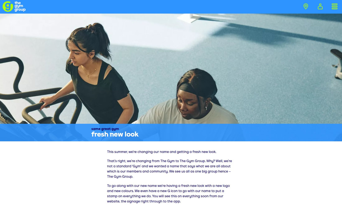
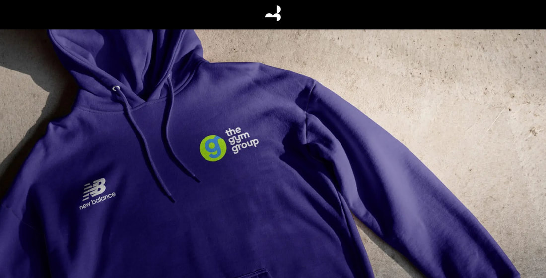
A good example for base color would be the blue The Gym Group kept after their 2022 rebrand but they changed the rest about their brand, including fonts and a new "g" icon.
Choose Your Accent Or Complementary Color
This is the color you’ll use most after your base color. Depending on your brand personality traits and the chosen color scheme, your accent color can complement or contrast your base color. Ensure your accent color pairs well visually with the base color and is also appealing to potential customers. It’s advisable to use a color wheel when picking complementary colors.
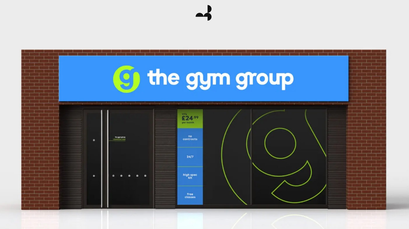
Staying with The Gym Group example, their whole process is explained on the Moving Brands website who helped them transition to their new identity. They chose this bright green as their accent color and if you're in the UK, you'll see they use it subtly in their clubs and marketing materials.
Choose Your Neutral Colors
These colors don’t attract attention and can ground your base and complementary color. We recommend getting two or a maximum of three neutral colors. One should be a dark neutral color for use in your paragraph text. Another should be a light neutral for your site’s background and supporting elements.
Think of white, black and its shades, maybe a grey as well so you have room for different branded materials, including name cards, posters, banners, online visuals, stationary or even apparel. See the example still from the case study of The Gym Group's rebrand from the Moving Brands website:
Final Thoughts
Creating a brand color palette for your personal training site, logo design, and other branding materials is crucial for brand recognition and customer acquisition.
Our guide will help you create a palette that will help develop a strong emotional connection with prospects and meet your business goals. You can also use a color palette generator, like Coolors, to simplify the process further.
Remember to trust your instincts too throughout the color palette creation process. Staying true to yourself will ensure you create a color palette that reflects your style while staying relevant to your brand’s mission.

