Did you know? A person’s purchase decisions are influenced by his/her primary senses. Humans are highly visual creatures and it only stands to reason that the sense of sight plays such an important role in consumer buying behavior. Often, one of the primary determinants of product or service purchase is its aesthetics, and what stronger component of aesthetics than color?
Research by the Nielson Norman Group found that people who visited websites with great visuals often overlooked usability issues such as broken links or serious flaws in navigation. Whereas sites with poor design were often easily penalised for identical flaws.
Other research shows that 80% of customers recall a brand, its product’s, logo, and offerings based purely on the colors used by the brand. This is why it’s extremely important for new gym owners and personal trainers to keep color psychology in mind when designing their fitness websites.
Other research shows that 80% of customers recall a brand, its product’s, logo, and offerings based purely on the colors used by the brand. This is why it’s extremely important for new gym owners and personal trainers to keep color psychology in mind when designing their fitness websites.
Color Psychology in Health & Fitness
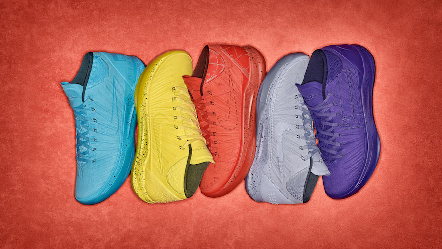
Color psychology has been used by fitness brands all over the world for years. But the most recent example is Nike’s Kobe AD shoes designed by pro-basketballer Kobe Bryant.
This signature collection of 5 shoes comes in 5 different colors, which signify 5 different areas of an athlete’s life:
- Purple: Overcoming physical challenges and limitations and setting farther, more difficult goals
- Red: Passion for the sport and a never-say-die attitude
- Yellow: Optimism and positivity; a belief that failure doesn’t determine who you are
- Gray: Calmness and neutrality, focus, and precision
- Blue: Dependability, trust, and honesty
Now, customers all over the world recognize the Nike Kobe AD’s solely on their signature colors and don’t need the Nike logo to identify the brand.
This is the pinnacle of brand success and as a business owner, the ability to have prospects recognize your brand only through colors and not through the logo or the tagline is the ultimate goal.
Your Website Colors
Your website is usually the first thing any prospect will see of your brand. Incorporating clashing color schemes is a surefire way of driving losing trust and giving visitors more reason to dislike your brand and leave your website. The right colors will help a fitness center owner position his/her website away and apart from the competition.
Of course, your site colors will depend on your logo and existing brand so to get a sense of how colors make your website visitors feel about your company, let’s talk about some of the more popular colors.
Of course, your site colors will depend on your logo and existing brand so to get a sense of how colors make your website visitors feel about your company, let’s talk about some of the more popular colors.
Lavender
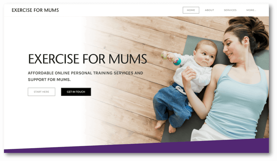
Lavendar is often associated with femininity and calm making it ideal for services like yoga classes. A calming lavender background for your website? Lavender works well with other pastel colors and are perfect for fitness classes like yoga and Tai Chi, which are essentially easy-going and focus on calming the body and mind.
Check out how our client Exercise for Mums uses purples and lavenders on their website and contrasts it with white.
Blue
At first glance, blue may seem too detached and relaxed for a fitness website. But, research has shown that blue has a unique ability to increase focus and concentration. Furthermore, lighter blues are often associated with services in the medical industry, like doctors, and can increase the trustworthiness of your website and brand.
Red
Powerful and invigorating, red lends a dash of spice to any website. Extremely energetic, red shades exude enthusiasm, making them perfect for a brands that deal in high energy and excitement.
It’s been observed that red’s energetic persona often inspires people to take immediate action; in the case of a fitness website, call the trainer and schedule an appointment.
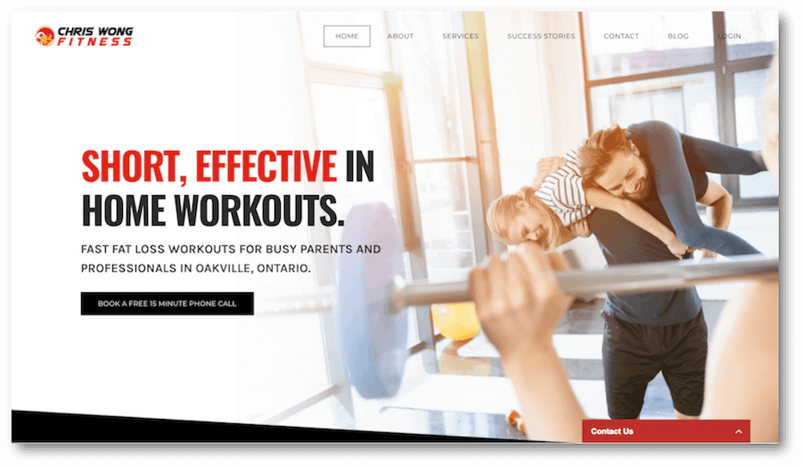
But remember that by itself, a red website can be very harsh on the eyes. So is a red-black combination. It’s best to mix red with white and pepper it with black writing, to give the website a classy look.
Managed Website client, Chris Wong Fitness uses reds to compliment an otherwise black and white theme.
Pink
Most pinks have an inherent ability to calm the mind and relax the muscles. But, bring out the neon shade and you’ll transform your website from something calming to something super competitive.
If your fitness website is marketing a dance class, Zumba center or Pilates class, then neon pink is the way to go.
Neon colors usually site better on a black background and work well when they accent another color. Try to avoid using any neon colors as a background color. Too much neon can kill the classy feel of your website and strain the eyes.
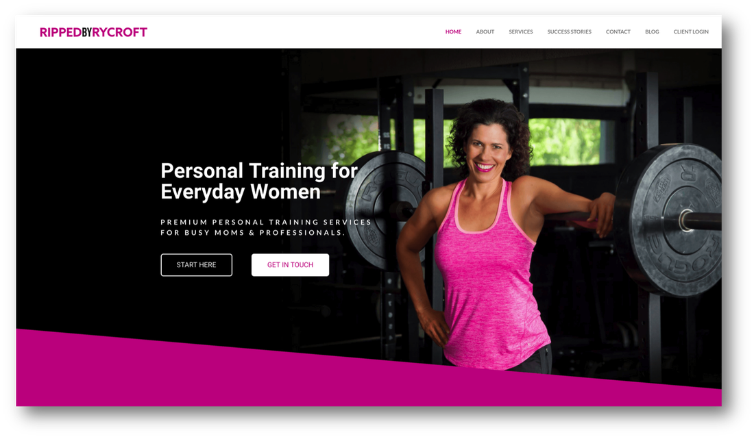
Ripped by Rycroft uses black to offset an otherwise vibrant and overwhelming pink.
Grey
Have you started a cross-fit training center for serious athletes? If yes, stick to serious colors like gray. Most seasoned fitness enthusiasts judge a fitness website and the trainer based on cues which indicate how serious the center is in offering focused training and support.
Anything on the grayscale screams 'focus' and for a website that offers advanced fitness services, gray tones are a great way to emphasize your professionalism and seriousness. Of course, this doesn’t mean you can’t play around with colors here.
Add a dash of deep red/rust or neon green/orange and bring a little life into the mix. Black lettering with standard fonts like Bodoni, Times New Roman, and Cambria are good here.
Green
Studies show that green shades are refreshing and boost energy levels in people. Not only are greens relaxing and meditative but they also offer a healing effect, reducing tiredness during and post-workout by reminding visitors of relaxing natural environs.
Medium-to-darker shades of green with light black or bright white lettering will have a pleasing and calming effect on the brain.
Medium-to-darker shades of green with light black or bright white lettering will have a pleasing and calming effect on the brain.
Choosing Your Colors
If you have no idea how to choose the colors for your personal trainer website or you think you might be a bit color insensitive, follow these simple rules:
And if you're having trouble picking your brand and website colors, try these tools:
Totally stuck? We love talking design. Get in touch and we'd be happy to help.
- Use black or white as your canvas. Black text on white or white text on black always work well. Your brand colors can then compliment this canvas.
- Use only one primary color for your brand. Especially if it's bright and vibrant. Too much of one color can feel sickly to the eyes.
- Light text goes on dark colors and vice versa.
- Separate large color blocks with black or white to reduce cognitive load.
And if you're having trouble picking your brand and website colors, try these tools:
Totally stuck? We love talking design. Get in touch and we'd be happy to help.

