Infographics are becoming one of the best ways to present statistics and to convey information visually. There are many ways to process information and everybody has their preferred medium, but visuals are certainly becoming more and more popular because they save time and are easy to digest.
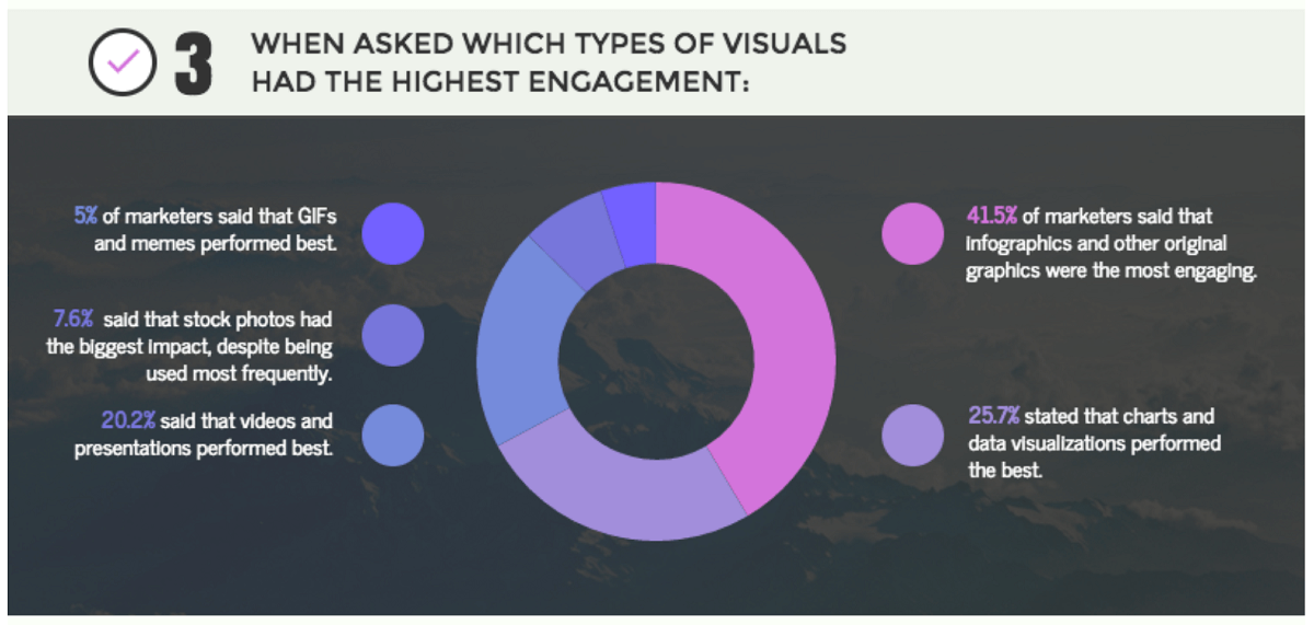
In fact, results of a study by Venngage showed that 41.5% marketers found infographics and photographs to be the best-performers in their content marketing strategy. In short, visuals generated the most engagement.
Why Infographics?
Depending on the topic a blog article can be anywhere between 500-1000 words and if written well it will be full of valuable information and data.
But 1,000 words can be a lot for some people so an infographic can be a great way to create brief descriptions for each data point.
Reading an article takes 5-8 minutes, while an infographic can take less than 2. When people have little time, their attention can be grabbed more easily with beautiful design, then the data can generate interest and the reader may even go back to the full article later.
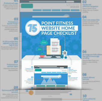
Check out how I used both type of content when writing about Fitness Website Home Page Design last week.
Infographics are great ways to serve up relevant data quickly and creatively. Here are 5 easy tips to create beautiful and engaging infographics for your audience.
1. Tell a ‘Story’ Your Audience Wants to Hear
Promotional content is overrated and often ignored. Today, people want information that is relatable and helpful. To meet these requirements, business owner must learn to understand their audience and find out what they need help with. Create a story around it and design a pretty and value-rich infographic.
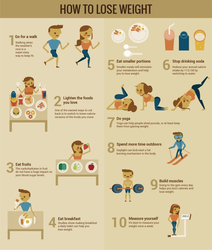
This example from Visually on how to lose weight breaks a complex subject down in to simple images:
This example from Visually on how to lose weight breaks a complex subject down in to simple images:
A simple list about methods that aid weight loss like this makes it super easy for the general public to understand. This has an easy flow and is extremely relatable.
When designing your infographic, use a tone that your audience identifies with and likes, use humour or relatable graphics so your readers can digest the information easily. Refrain from promotion type of mention of your PT business is recommended but if it's relevant, feel free to mention it, otherwise focus on kick-ass branding so people know exactly where the advice is from.
2. Keep The Design Simple and Focused
When we talk of simplicity, we refer to both the flow of the story and the style of the design. Choose relevant images to complement the story and follow its flow. That will make it easier for your audience to read and understand the content.
Try not to squeeze multiple photographs and icons next to each other with little spacing. A good infographic is one which has a balance between text, pictures, color and white space. As a rule, for every 1-2 lines of wording, there should be one image/icon. Be consistent in your font style, size and word count in each section.
When it comes to color, use a standard color-scheme that matches or complements your brand colors. Stay consistent throughout the infographic to keep the design clear, simple and balanced.
3. Stay on Brand
Your infographic should be designed to appear as if it has come from your company. This can only be done if you remain mindful of the fonts, colors and white space.
When it comes to styling, there are certain key tips you need to follow:
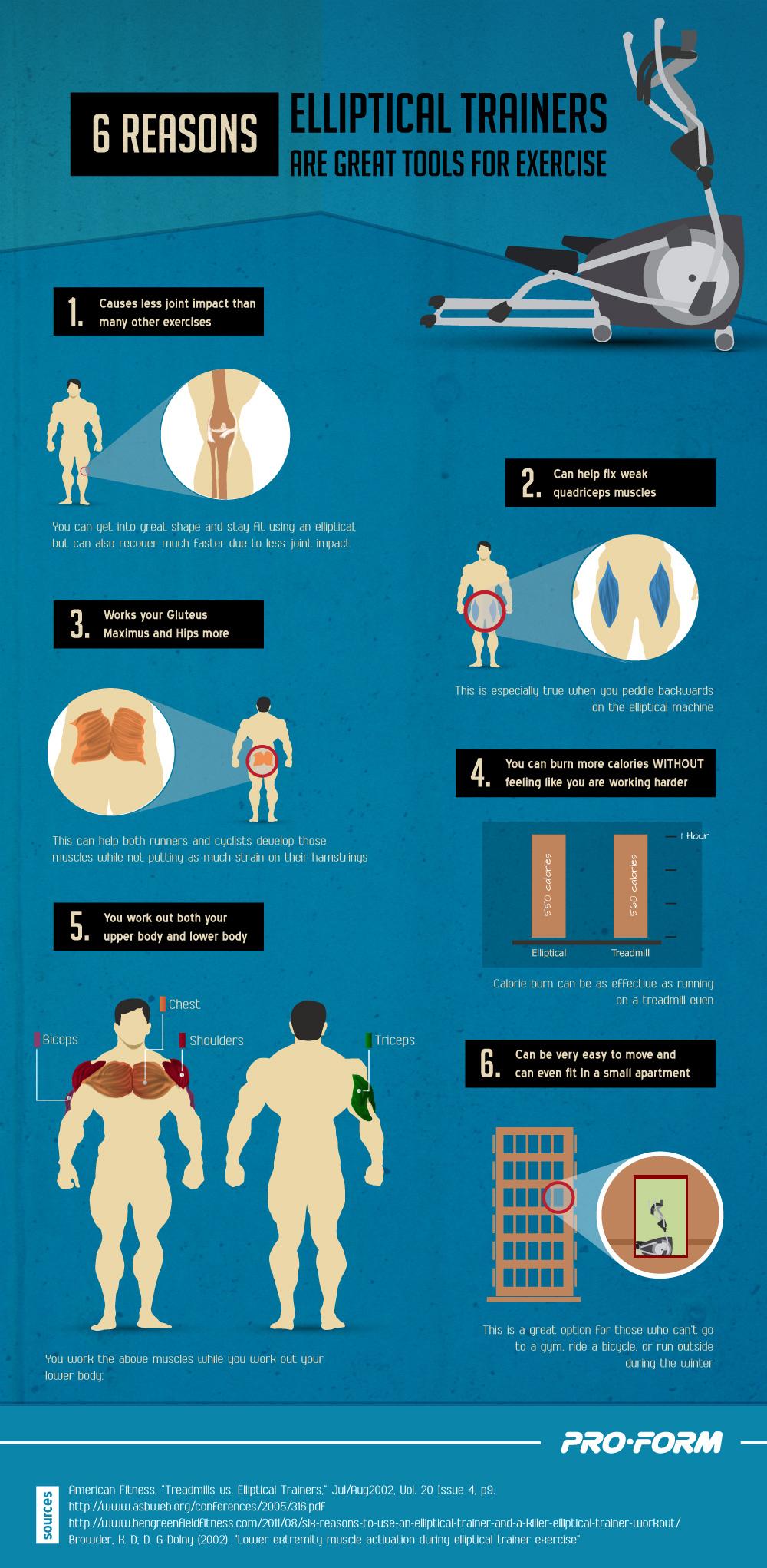
You can see here how ProForm have matched the infographic branding to the branding of their website.
When it comes to styling, there are certain key tips you need to follow:
- Stick to a single font type and use it throughout the infographic (Helvetica, Lato and Arial work well – size 12-14 pts)
- Make sure your typography matches the topic/theme you’re writing about (stick to professional sans serif fonts if it’s an informative piece and go with freestyle and display fonts if it’s an entertainment piece)
You can see here how ProForm have matched the infographic branding to the branding of their website.
- Align all sections the same; for example, all your headers should be center aligned if the first header is center aligned and so on for images and follow-up paragraphs
- Use as little text as you can – stick to keywords, icons, images and symbols
- Space the objects on the infographic evenly – there should be enough whitespace to make the content look legible
- Whitespace doesn’t always have to be white; you can use colored backgrounds and still add legible space between your words and icons
- Don’t use flashy and contrasting colors for text and backgrounds (stick to black & white, brown & white, red & white, navy & white); and don’t use patterned backgrounds as they can be distracting and hard on the eye.
4. Optimize for SEO
SEO-optimizing your infographic isn’t as challenging as it sounds. With the right moves, you can make your infographic highly-visible to audiences globally. Let’s start with the keyword. Your headers and supporting text are great places to use keywords. Use a single keyword 2-3 times across the infographic for consistency.
Next, we have the Alt text. This is the text that loads in the image box, when the image fails to load on the page. Your image tags and Meta data are great for SEO-optimization, use relevant keywords here to discribe your infographic.
Then we come to the URLs. To make your URLs SEO-friendly, use only real, full and readable words, ideally including your keywords.
5. Stay True to the Facts
It’s important to use figures and facts which are real and verifiable. Attribute where necessary and make sure to back link the websites which you’ve used as the primary source.
Use reputable sources, like data from statistic agencies, relevant publications and research papers. They will boost your SEO too. If it’s your own article that you’ve used as a source, make sure to mention that it’s primary research. Cite sources where needed.
Remember to provide facts that are topical, relevant and helpful. Your audience will look for value content, so make sure they get an overall User Experience (UX) that they won't forget.

