So, you’ve just finished your fitness website. You’ve got the design done, some awesome images of yourself and your clients and you’re finally getting some traffic to it.
The issue is, the traffic isn’t converting into clients…
Well, in this article, we’re going to give you the top 11 reasons why people are leaving your fitness website before converting.
1. Ineffective Copy
The copy is the written text on your fitness website.
The best fitness websites don’t just talk about the personal trainer who is delivering the service. The best sites speak to their ideal clients about their pains and problems. The copy then presents the personal trainer’s service as the solution to their clients' problems.
One issue is that your copy isn’t persuasive enough. A lot of personal trainers just write about their achievements and qualifications instead of focusing on their ideal clients.
Fix:
One option is to try and focus some of your writing on your client’s pains and problems, and presenting your service as a solution.
2. Design is Outdated
Let’s be blunt. Aesthetics matter and research by the Nielson Norman Group confirms this. They found that design is the number one credibility factor when a visitor lands on your website.
In other words, if your website looks like crap, people will trust you less. We buy things from people we know, like and trust.
Here's a before...
In other words, if your website looks like crap, people will trust you less. We buy things from people we know, like and trust.
Here's a before...
And after of a website we redesigned...
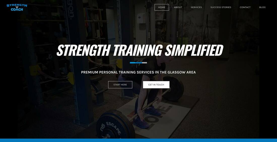
The before was slow to load, poorly branded and didn't clearly state what the company did.
Many times, your clients first point of contact with your business will be on your website.
With personal training being such a competitive and highly visual market, you need a website to start instilling trust in your potential clients from the moment they land on the site.
Having an outdated website design may cause these potential clients to click away - losing the lead forever.
3. Your Content is Difficult to Read
Following on from design, the best fitness websites use easy-to-read fonts, colours and sizes. If it can’t be read, it’s very unlikely to convert well.
In more research, Nielson Norman Group found that people rarely read all of your website content. In fact, 79% of users scanned the headers in search of the information they were looking for.
Fix:
We recommend using a consistent font selection throughout the whole site to create a consistent brand message, use impactful headers and break your content up in to smaller, legible sentences. Using high-contrast colours that are easy to read and sticking to larger fonts also improve reading experience.
4. Auto-Play Videos
Having something auto-play as soon as your prospects lands on your fitness website is probably the easiest way you can get a visitor to never return to your site.
In today’s modern world, most people want to choose when and where they consume their content.
Fix:
We recommend ditching the auto-play and having it as a manual button. If you're using a video as a background header, which can look great by the way, be sure to switch off the sound.
In today’s modern world, most people want to choose when and where they consume their content.
Fix:
We recommend ditching the auto-play and having it as a manual button. If you're using a video as a background header, which can look great by the way, be sure to switch off the sound.
5. Navigation Structure is Unclear
It’s probably happened to you - you’ve been on a website, and rather than it being an easy experience, it’s become both a nightmare and maze to navigate.
And what did you do? Probably close the website down...
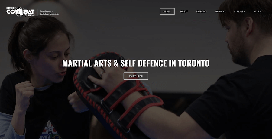
The best fitness websites have very clear navigation menus that are easy to find, easy to use and are well organised. The House of Combat navigation is a prime example. It's easy to find everything you might be looking for as a potential client.
And what did you do? Probably close the website down...
The best fitness websites have very clear navigation menus that are easy to find, easy to use and are well organised. The House of Combat navigation is a prime example. It's easy to find everything you might be looking for as a potential client.
Fix:
Visitors are looking for key information to help them decide fairly quickly if your services are for them. Display your main pages in your navigation so the readers can quickly navigate to find what they are looking for: Home, About, Services, Contact and Blog, even if you use a synonym on the label are key pages people will look for.
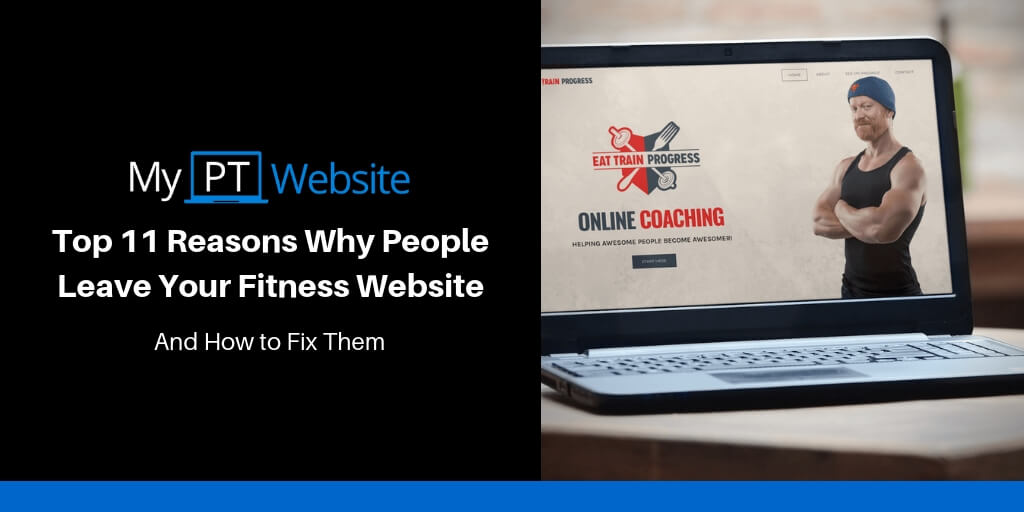
6. Site Lacks Character
At the same time as wanting to have a copy that speaks to your ideal client, your site needs to have a decent level of character and personality.
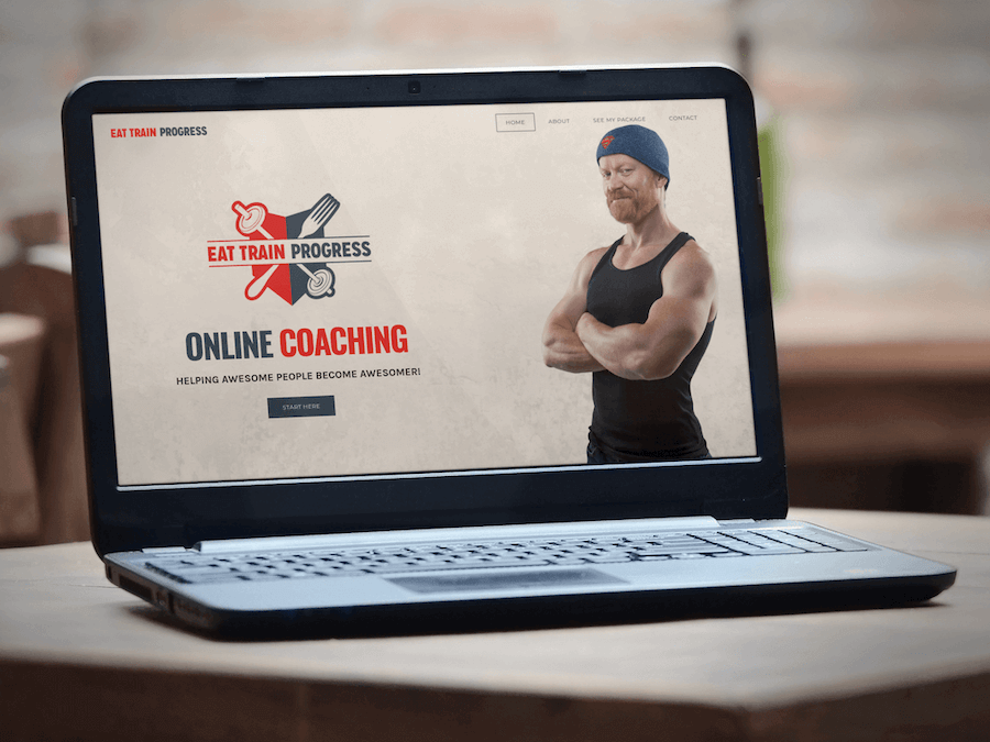
It’s got to have an injection of “you” as their coach. Look at Patricks, Eat Train Progress as a prime example.
It’s got to have an injection of “you” as their coach. Look at Patricks, Eat Train Progress as a prime example.
Fix:
People buy into people, and having a great “About” page that shares your story, your values and your experiences is a great way to keep people engaged on your fitness website.
Use action pictures to show your potential leads what it's like to train with you, write your Bio in the same way you would speak to clients and shine your unique personality.
Recommended Article: The 4 C’s of a Successful Fitness Website - character is one of them.
7. Too Slow to Load
Neil Patel did some research into the patience of user’s when it comes to site load times, and nowadays people expect your mobile site to load as fast as your desktop site.
The longer people wait, the more likely they are to abandon your site, with 47% of consumers expecting the website to load in 2 seconds or less.
Fix:
Optimise your visual content. Size and compress pictures appropriately. Use video hosting platforms, like YouTube instead of uploading a huge video file to your server. Add plugins and animations in moderation only where they serve a purpose.
8. Your Lead Magnets Are Irrelevant
Lead magnets are a great way to keep users engaged, however, if your offer is irrelevant to your target audience, it’s a pretty easy way to disengage them.
In addition to the lead magnet being irrelevant, the messaging or landing page may also be less than appealing to your users.
Fix:
You could split test different landing pages, titles and copy to see what resonates with your potential clients.
Recommended Article: How To Create an Irresistible Lead Magnet to Attract More Personal Training Clients
9. Your Service Benefits Aren’t Clear
The best fitness websites don’t just talk about the features, e.g. 45-minute sessions or group-personal training sessions, they also talk about the benefits of their services.
People can get bored reading lists of features, and just click off your website.
What are the benefits of your services? Will your clients feel more energy? Or could they drop a dress size in a number of weeks?
Fix:
You may choose to list the benefits as well as your features to keep people on your site.
10. No Calls-to-Action (CTA)
The goal of your website should be to generate a new lead for your business, so you can have a conversation with them and potentially sign them up as a new client.
If you don’t encourage your potential clients to leave their details or get in contact with you, it’s highly unlikely that they will.
Fix:
Many trainers choose to have compelling and relevant calls-to-action throughout their site to help conversion rates. Choose CTAs with your ideal clients' next logical step in mind and provide links to your Contact page wherever is relevant.
11. The Site Isn’t Mobile Responsive
If your site isn’t mobile responsive, not only do you make it more likely for your potential clients to click off your fitness website, but it can also affect your SEO efforts.
Not to mention that according to the latest statistics 52.2% of all internet traffic was through mobile devices and that number is increasing by the year based on Statista's chart. It's expected to pass 60% in 2019.
Not to mention that according to the latest statistics 52.2% of all internet traffic was through mobile devices and that number is increasing by the year based on Statista's chart. It's expected to pass 60% in 2019.
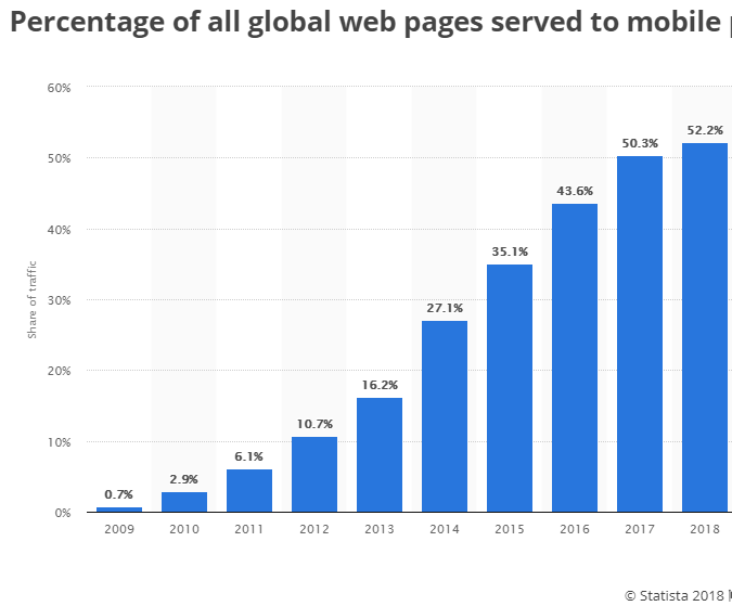
Bottom line: you want your website to look good on mobile too. Ensuring your site is mobile responsive is a quick win.
Fix:
You can do a mobile-friendly test using the Google tool here. If your current website is not responsive, spea to your web designer or choose a theme within your DIY platform that is.
Conclusion
By ensuring that these issues are covered on your fitness website, you will greatly improve the performance and user experience.