Pop-ups can be one of the most challenging website elements to get right. If you perfect the relevance and timing, pop-ups can result in more leads for your business and ultimately greater profits. Get it wrong, though, and you'll have a very annoyed website visitor on your hands.
In this article, we'll look at some of the most common mistakes when creating pop-ups and the top 9 pop-up examples we found that are doing a great job.
What are the benefits of pop-ups?
There are many reasons why you may want to add pop-ups to your fitness website:
Increase Conversion Rates
Pop-ups typically promote one of your services or an offer you are running. As the message will be readily available and people do not have to search for it, they will be more likely to take advantage of the deal so long it matches their next step on their client journey.
Grab Attention
As a pop-up appears, it disrupts whatever the website visitor is doing and takes their attention. Usually, they need to click off the pop-up for it to disappear. This means that the visitor has to pay attention to the pop-up, decide whether or not they are interested in it, and then take the next step.
Showcase Your Brand
As a pop-up will be one of the first things people see when they land on your website, they present you with the perfect opportunity to put your best foot forward when showing off your fitness brand and the services you provide. As they say, you do not get a second chance to make a first impression. So, getting your pop-up right can be an incredible branding tool for your business.
Can Be Completely Customized
There are no limits when it comes to the design of a pop-up. You can use pop-ups to showcase new services, communicate holiday hours, ask for feedback, announce special offers, and encourage newsletter sign-up.
Fitness Website Pop-up Mistakes
One of the most significant issues with pop-ups is that it's easy to get them wrong. There's a very thin line between what works and what doesn't. If you get the timing wrong or your pop-up is irrelevant, you're going to annoy your viewer, and this can result in lost leads and sales, which is the last thing any personal trainer or fitness professional wants.
So, what are some of the biggest pop-up mistakes we see on fitness websites?
So, what are some of the biggest pop-up mistakes we see on fitness websites?
- Deceptive pop-ups - Some pop-ups are misleading without meaning to be. For example, adding a "call now" button with your phone number makes it feel like you'll answer the phone right at that moment. But what if it's 3 am in your area? The best thing to do here is to have two pop-ups based on the time. You could have a phone number CTA during your working hours and email contact for the remaining hours.
- Poor targeting - Generic pop-ups don't work well. A good example is when a website prompts someone to sign up for their newsletter on their Services page. In that case, the website owner might lose precious leads who don't get in touch after getting on the newsletter.
- Difficult close buttons - Don't make it hard for your user to 'x' off the pop-up.
- Bad timing - Timing makes a massive difference in pop-up conversions. Logically think about when a pop-up would be helpful. A pop-up in the middle will not be well received if someone is watching one of your workout videos. But if someone's about to exit your page and you offer them to receive updates via your newsletter, you might get a new subscriber.
- Too many input fields - The Internet is all about convenience. Don't ask your users to do too much.
- Condescending call-to-action buttons - Nobody wants to be disrespected. "No, I don't want to be healthy" or "No, I don't want to look my best" is not a good move. No one will want to work with a personal trainer who makes them feel inferior, so an unattractive opt-out button doesn't help visitors change their minds.
9 of The Best Fitness Website Pop-Ups
Now that you understand the benefits of fitness website pop-ups, let's take a look at ten examples so you can get the inspiration you need:
#1. Future Fit
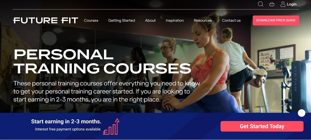
Future Fit uses pop-ups to test what draws more attention. While last month they had a temporary discount offer, this time you get a pop-up that only takes up the bottom strip and teases website visitors with some info on how quickly they can start earning money.
The pop-up doesn't disrupt what you're doing because you can still see the page's content, and it doesn't feel intrusive. The language is friendly and quick and easy to 'x' out. The only purpose of this pop-up is to encourage people who want to be personal trainers to get started.
The pop-up doesn't disrupt what you're doing because you can still see the page's content, and it doesn't feel intrusive. The language is friendly and quick and easy to 'x' out. The only purpose of this pop-up is to encourage people who want to be personal trainers to get started.
#2. The Bridge
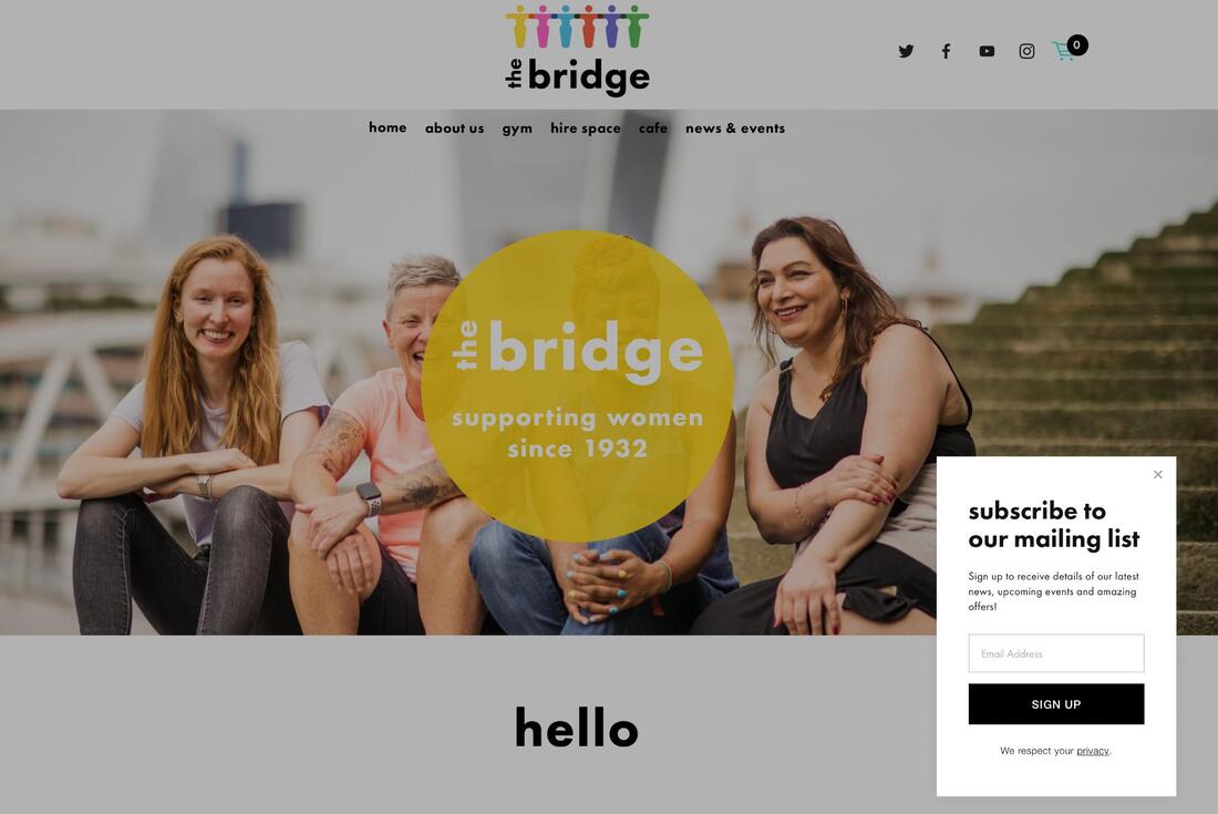
Popping up in the right-hand bottom corner, this pop-up is discreet and unobtrusive. You can still see the homepage, meaning the pop-up does not distract from The Bridge's beautiful branding. Plus, with just one field to fill in, it's quick and easy to subscribe to the newsletter.
#3. Sam Pepys
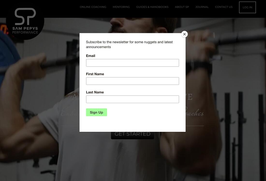
Similar to the previous example, the key here is the simplicity of the pop-up. It is short and sweet, easy to understand, and you can quickly close the pop-up too. One extra thing worth noting about this pop-up, in particular, is that it is also optimized for mobile use, which is always something you need to consider.
#4. Flexit
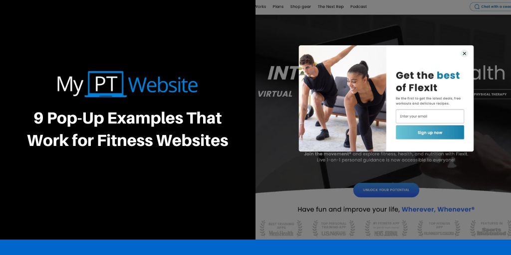
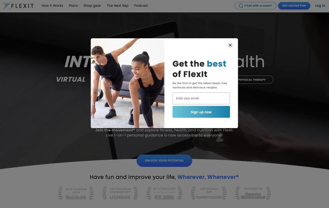
This is the first pop-up on the list with visuals, and don't they work well? The image is friendly and on-brand without reducing the pop-up speed. Again, there's only one box to fill in. The CTA button is attractive. Also, the pop-up cleverly does not overlay the trust signals and awards on the homepage.
#5. Sexy Overweight Women
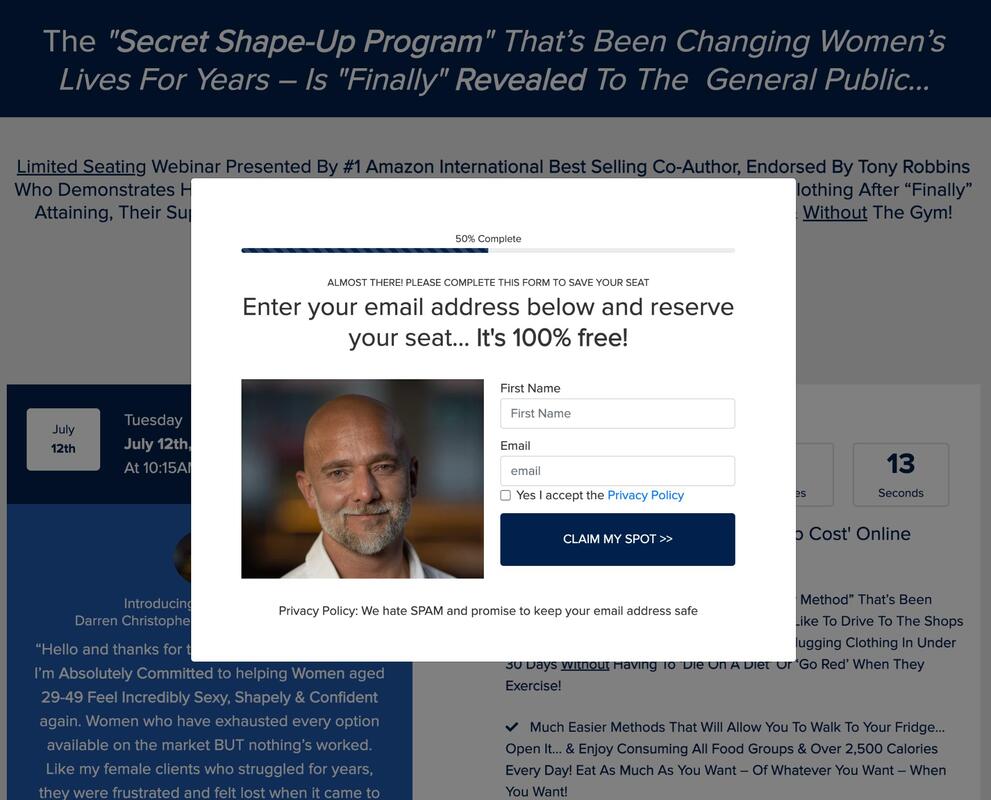
Sexy Overweight Women is a shape-up program for females. While the brand name itself splits opinion, one thing we love about this pop-up is the "privacy policy" bit at the bottom. People hate spam! So, reassuring your website visitors that you won't spam them or pass on their details if they sign-up can be the difference between acquiring a lead or not.
#6. SimplyBook.Me
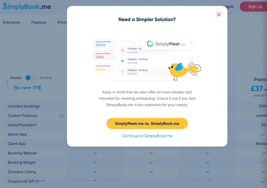
Simply Book is a scheduling tool that is popular with a lot of personal trainers and fitness brands. When you head to the company's pricing page, a delayed pop-up promotes their other product. That's the man reason it made it to this list.
Simply Book is quite a comprehensive tool, so they promote their simpler and cheaper option, SimplyMeet.Me, ensuring potential customers end up in the right place, so the company doesn't miss out on clients who find their flagship product too overwhelming. This is a clever trick if you offer more than one service.
Simply Book is quite a comprehensive tool, so they promote their simpler and cheaper option, SimplyMeet.Me, ensuring potential customers end up in the right place, so the company doesn't miss out on clients who find their flagship product too overwhelming. This is a clever trick if you offer more than one service.
#7. Brandon Hepburn
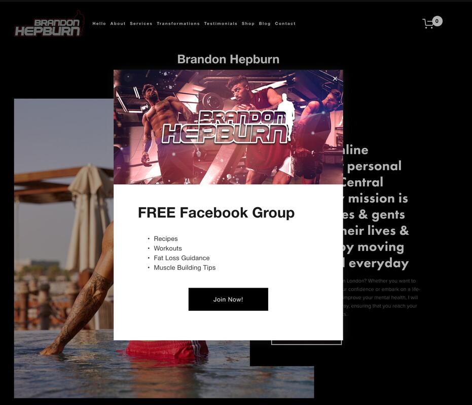
A pop-up can provide you with an effective way of promoting your social media platforms, and this is something Brandon does incredibly well. The pop-up is on-brand, thanks to the striking banner image, and you know exactly what you will get by joining his Facebook group. This is an excellent way of growing your audience online.
Since the pop-up is delayed, we suspect this is how Brandon intends to lock in website visitors who may not want to keep browsing his website.
Since the pop-up is delayed, we suspect this is how Brandon intends to lock in website visitors who may not want to keep browsing his website.
#8. Fit & Well
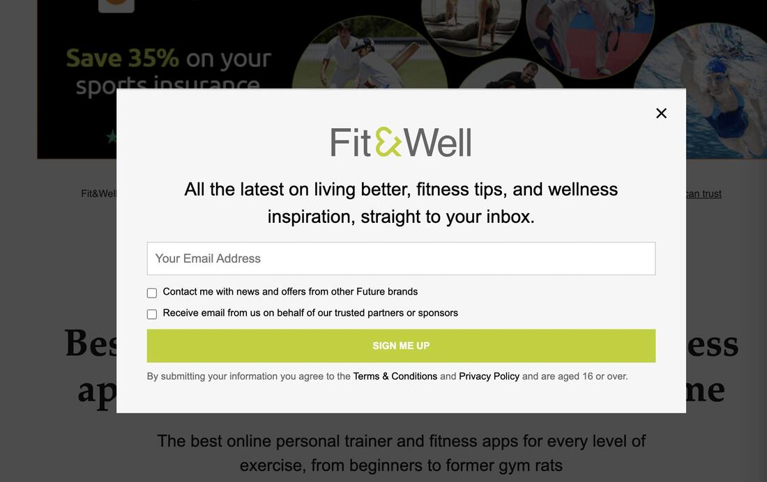
We love that this pop-up is perfectly on-brand. Fit & Well uses its brand colors, logo, and main font, ensuring a sleek and stylish appearance. You can quickly input your email address and sign-up. But if you don't want to, closing the pop-up is a breeze. You can also opt into receiving emails from partners rather than opting out, which is always preferred.
You can also check the Terms & Conditions and Privacy Policy before giving out your contact details, which is a plus. In the 21st century, cyber security is crucial for many of your ideal clients, so knowing you'll look after their data builds trust.
You can also check the Terms & Conditions and Privacy Policy before giving out your contact details, which is a plus. In the 21st century, cyber security is crucial for many of your ideal clients, so knowing you'll look after their data builds trust.
#9. Shelley Booth
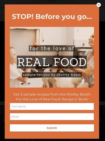
Finally, another effective way to use a pop-up is by integrating a lead magnet, i.e., something free that shows the value of your service and generates leads. This is something Shelley Booth does incredibly well, offering three sample recipes from her e-book. People love receiving things for free, which tempts them to hand over their contact details.
Wrapping Up
Pop-ups aren't necessarily the evil of fitness marketing, but they can be more annoying than helpful for your personal trainer website visitors if you get it wrong. Use the tips and examples in this article to create a pop-up that works for your fitness business.

