A massive 52% of internet searches are conducted on a mobile phone that applies to potential clients looking for personal training too. If you’ve not taken steps to optimise your website for mobile use, you may be missing a trick.
It’s been five years since Google announced they would include mobile optimised websites in their search algorithm, but if you’re new to personal training - or just new to managing your personal training website - this might be something that you’ve not attempted yet.
Your potential clients are looking to get personal training information quickly and clearly presented on your site. If they can’t find what they’re looking for, they’re likely to search somewhere else.
Here’s a checklist of the important elements you need to consider for your personal training website.
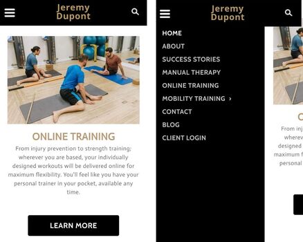
1. Navigation & Menus
Navigating around your website should be simple and clear. Any navigation menus should have no more than 5 or so items in them - due to the smaller screen size of a mobile device. If your normal navigation bar has far more, consider a more streamlined option for mobile browsing, with the most popular pages available in the menu.
2. Forms Should Be Easy
Making the process of filling out a form - particularly a payment form - straight forward is essential. Making the checkout process brief and clean looking will be important if you make sales through your website. The rule here is to ask for only what’s 100% necessary - know that once you have their contact information, you can always reach them at a later date if you need more detail.
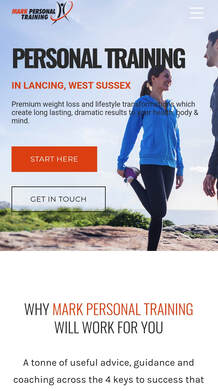
3. Calls To Action
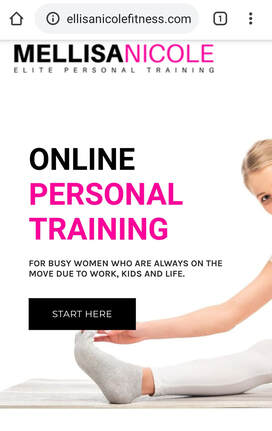
A call to action is an invitation for your client to take just one action on any page. It might be any number of things, but your goal is to make it the only thing you’re asking them to do on any given page.
Not only should it be clear, but it should be visually striking - standing out in a special colour, and “above the fold” meaning it can be seen without any scrolling. Using a clear and concise call to action lets your client know what they will be directed to next, and is likely to improve your conversion rate.
Not only should it be clear, but it should be visually striking - standing out in a special colour, and “above the fold” meaning it can be seen without any scrolling. Using a clear and concise call to action lets your client know what they will be directed to next, and is likely to improve your conversion rate.
4. Filters And Searching
People don’t want to be scrolling around looking for a particular thing on your site. Having a filter or search function should return the exact thing your clients are looking for in your business.
The key element with mobile browsing is to make the process as direct and straight forward as possible. If you have multiple options on your website (perhaps you sell branded merchandise) you may want to consider making sizes, colours and styles available in the filter.
The key element with mobile browsing is to make the process as direct and straight forward as possible. If you have multiple options on your website (perhaps you sell branded merchandise) you may want to consider making sizes, colours and styles available in the filter.
5. Contact Page
On your personal training website, you may want potential clients to be able to reach out and ask questions of you before they buy. If you’re optimising for a mobile, you can have this set up to call or text you from their mobile phone with a ‘click to call’ feature.
Some people may prefer to email, and it could be a good idea to ‘split test’ both features to see which your audience prefers. You can even integrate a Google maps feature so any questions about location or directions are anticipated ahead of time.
Some people may prefer to email, and it could be a good idea to ‘split test’ both features to see which your audience prefers. You can even integrate a Google maps feature so any questions about location or directions are anticipated ahead of time.
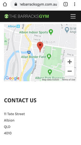
Near this contact feature, you could include a FAQ feature so people could check their question first before reaching out to you.
6. Keep Mobile Use In Mind
One of the most common complaints with using a personal training website is that the buttons are too small and fiddly to use easily. Using large navigation buttons which are easy to click on and see on a small screen, as well as using white space to make sure your content isn’t squashed together will help the readability of the site.
A minimum area to be tapped by a user’s thumb is around 45px square so it’s worth keeping that in mind when designing buttons and links.
A minimum area to be tapped by a user’s thumb is around 45px square so it’s worth keeping that in mind when designing buttons and links.
7. Load Times
A general rule of thumb is that your website should load in 4 seconds or less. For mobile users, they are likely to be even less patient of slow loading times than that.
If someone clicks your website and then clicks off it due to a slow loading rate, this is called a bounce rate. It’s one of the metrics that you want to monitor on your personal training site, and you want to keep both loading times and bounce rates as low as possible.
Ensuring your site is under 1MB means that it can be loaded both on WiFi & 3G/4G. This might mean having a mobile site which has far fewer images on it than your desktop version.
8. Pop-Ups
Pop-ups on a mobile device can be even more irritating than on a desktop as they generally don’t work well.
They get in the way of what you want your clients to see - due to the smaller screen space available on a device.
They can also be a significant distraction from your call to action, meaning than your potential client may not see the option to download your lead magnet, or book that appointment with you.
Including pop-ups on your site is something that you might want to research with split testing but often isn’t a good choice for a mobile optimised site.
9. Keywords
When considering keywords, it’s important to think about how your users will be searching for on their mobile, rather than at a desktop.
Mobile users are more likely to use questions based on location so using a keyword relating to the town that you operate your personal training business from, or even a postcode could be powerful.
They are also more likely to use questions when searching, so:
Can be an effective way to adjust your content marketing to those users that are browsing your site for help.
Mobile users are more likely to use questions based on location so using a keyword relating to the town that you operate your personal training business from, or even a postcode could be powerful.
They are also more likely to use questions when searching, so:
- How
- When
- Where
- What
- Why
Can be an effective way to adjust your content marketing to those users that are browsing your site for help.
10. Layout
The layout of your site should move your potential client from one page to another, gradually getting them to see an overview of how you run your personal training business and learning about you and your methods.
That’s why you may want to include a free lead magnet or free access to the information you’ve written before asking your potential customer to buy from you. In terms of the layout, you’re guiding them through using your website and earning their ‘buy-in’ to build that relationship with them first.
Mobile browsing is growing in popularity every year. It could be an excellent investment to learn ways that you can help your potential clients to use your website. This will also improve your rankings in Google, and optimise you for search engines.
Mobile browsing is growing in popularity every year. It could be an excellent investment to learn ways that you can help your potential clients to use your website. This will also improve your rankings in Google, and optimise you for search engines.