Your website is the “hub” of your online marketing strategy. It's the place where leads will discover your business and convert into future clients.
Having a solid personal trainer website is like having a salesman working for you around the clock, showing your competencies and how you can solve problems in your client’s lives.
That being said, with the constantly changing technical landscape, your website can often need updating. However, you may not have the resources to invest in a redesign.
For that reason, we’ve put together a list of 10 tips to improve your personal trainer website, so your future clients have a much better user experience.
1. Use Plenty of White Space
Having plenty of white space ensures your personal trainer website looks professional, spacious and clean.
It means that your website visitors will be focused on the text and what you have to say, instead of getting distracted by ads or links either side of your writing.
It can make it much easier for them to digest your information and take appropriate calls to action.
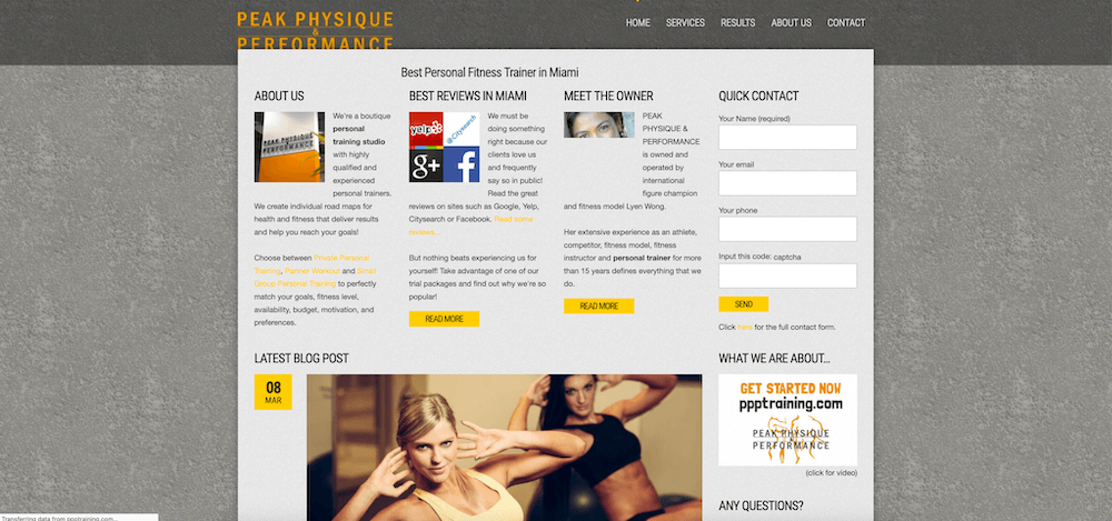
Check out this site. It's quite busy and difficult to focus on where the relevant info is and what to do next:
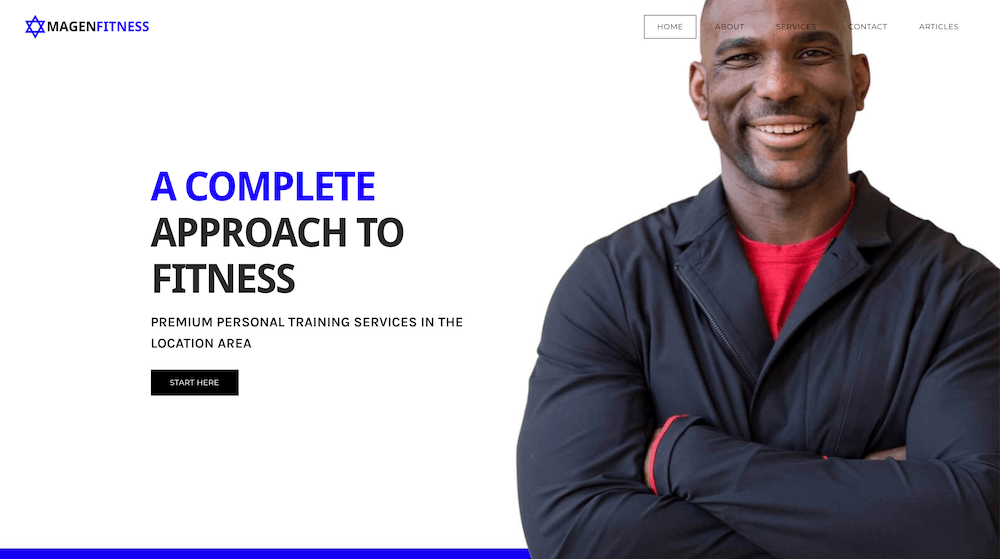
Whereas this site we've just started working on is clean, clear and simple to use:
2. Optimise Your Page Speed
Having a fast loading speed is essential for user experience. Having a slow loading speed that lasts 5 seconds on your personal trainer website can increase the bounce rate by up to 20%.
Want to improve your speed?
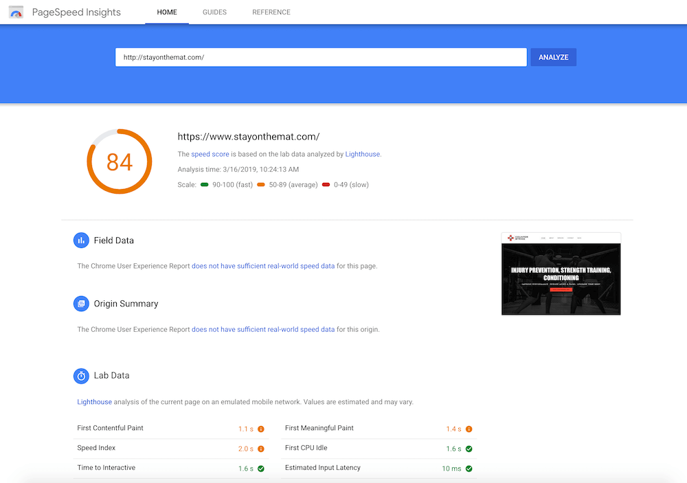
You can use Google’s page speed tester here to see how your site is currently performing.
Want to improve your speed?
You can use Google’s page speed tester here to see how your site is currently performing.
Google will then offer your some suggestions on how to improve it. Implement those changes to optimise your page speed and improve your personal trainer website design.
3. Use Relevant Calls-to-Action (CTA)
The visitors on your personal trainer website want to be able to easily take the next step with you.
Ensuring that these CTAs are distinguishable from the site’s content is a great way to improve conversions and user experience.
Create buttons that are large and have relevant and actionable verbs, such as “Download”, “New? Start Here” or “Contact Us”.
Ensuring that these CTAs are distinguishable from the site’s content is a great way to improve conversions and user experience.
Create buttons that are large and have relevant and actionable verbs, such as “Download”, “New? Start Here” or “Contact Us”.
4. Make Sure Hyperlinks Stand Out
When you change the colour of a text to blue or to your brand colour and underline it, you are letting your user know that this is a link that they can click on to take them to a new page.
This is usually done automatically depending on the designer platform you're using, but the hyperlinks can often be a default colour or indistinguishable from the rest of the text.
This is usually done automatically depending on the designer platform you're using, but the hyperlinks can often be a default colour or indistinguishable from the rest of the text.
5. Use Lists and Bullet Points
In the fast paced world of modern day technology, many people will scan your content instead of reading it all word for word.
Be sure to include all the key information in the headers and break up the text with bullet points makes it easier for your users to consume the information in a short amount of time.
You may choose to get creative - you could use dumbbell or physique icons for your bullet points instead of traditional ones.
6. Use Images Effectively
Personal training is a highly visual service, and many potential clients will judge your website on the quality of your images.
Brand savvy people will recognise the difference between stock photos and high quality professional photos that you have had done for your business. It's recommended that you hire a professional to take your photos as soon as you have the resources.
The best personal trainer websites have professional photos. It may include workout shots of the trainer training clients, images of the gym/studio and so on.
7. Use Well Thought Out Headers
Headings convey information to your website users instantly.
It’s important to carefully choose them. Often your heading will play an important role in whether your potential client will (or will not) read the main body of content, scroll down the page and takes their next logical step. They will want to know they are in the right place.
It’s important to carefully choose them. Often your heading will play an important role in whether your potential client will (or will not) read the main body of content, scroll down the page and takes their next logical step. They will want to know they are in the right place.
In addition to this, headings will be used by search engines to rank your page based on the keywords you use.
The most effective personal trainer websites take SEO and user experience into account simultaneously.
8. Keep the Design Consistent
Ensuring that the design on each page is consistent with your brand will help communicate the personality of your business more consistently.
Consistency in the design means that your users will know that they’re still on the same website, reducing bounce rates and helping build trust in your business.
It may be beneficial if you are using a branding guide to keep things consistent. Check out how to create your very own branding guide here.
9. Catch Your 404s
404s are the error message you see in the browser window when the page you tried to open can’t be found. If one of the links TO your website ends up running into a 404, it can ruin that user’s experience. Some people may find it annoying and never try to get onto your website again.
To check if you have any 404s, you can use Google’s tool here.
The best personal trainer website’s have no 404s, and they are fixed immediately.
To check if you have any 404s, you can use Google’s tool here.
The best personal trainer website’s have no 404s, and they are fixed immediately.
10. Make Sure the Website is Mobile Responsive
With so many users using their mobile phones or tablets to navigate around the internet (over 50% of all internet traffic), it’s imperative your personal trainer website is 100% mobile friendly.
Google has recently started penalising websites that aren’t mobile responsive, meaning that it can have an impact on how your website is ranked.
You can test if your website is mobile friendly here.
Google has recently started penalising websites that aren’t mobile responsive, meaning that it can have an impact on how your website is ranked.
You can test if your website is mobile friendly here.
Conclusion
Implementing these 10 tips should see your website's user experience improve, which can result in more users, more relationships and more sales. We want to know - which one stood out the most for you? Let us know in the comments below.

