I've been playing with heat maps for some time now to improve our process and generate more leads for our Managed Website service. I believe a website is only as good as the number of conversions it generates. A website that doesn’t help you get any audience engagement or contact is one that needs work.
These days, we have tools like Google Analytics that tell us where a visitor comes from, which website he was on before, which pages he viewed on your website and how they moved across pages. But what Google Analytics doesn’t tell you what they’re actually doing on your website.
Analytics tools don’t shine light on how website visitors interact with your site, the buttons they click and how far down the page they scroll. But heat maps do.
Analytics tools don’t shine light on how website visitors interact with your site, the buttons they click and how far down the page they scroll. But heat maps do.
What are Heat Maps?
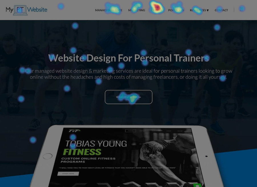
Heat maps are a graphical representation of how a website visitor navigates your personal trainer website, what he does when he’s on the website, which links he clicks and where he finds a dead end.
They are plugins which you install on your website to learn how attractive and effective your website elements are in generating engagement and conversions.
Heat maps showcase results using a combination of colors. Each color represents a specific level of activity that the visitor engaged in. For example, areas in red are the most viewed areas. Blue areas are the cold spots, ignored by visitors and which remain unseen.
Do You Even Need a Heat Map
This is where some of you will drop off. Heat maps can be useful for everyone, yes. But only if you're getting a lot of traffic to your website.
For example, if you're only getting a dozen website visits per day, even a month of heat map data isn't enough to make any real solid research based decisions.
But they could come in handy if you're sending paid traffic to a page or implement a fitness marketing strategy.
Heat maps help us in two specific ways:
Let’s take a look at how this happens.
For example, if you're only getting a dozen website visits per day, even a month of heat map data isn't enough to make any real solid research based decisions.
But they could come in handy if you're sending paid traffic to a page or implement a fitness marketing strategy.
Heat maps help us in two specific ways:
- They help us improve our site layout
- They help us better our website design
Let’s take a look at how this happens.
Heat Maps and Site Layout
Your website layout is affected by multiple things from content length to the images used. Heat maps give us information about every element that affects the quality of your website layout and its usability. Take a look:
Content length
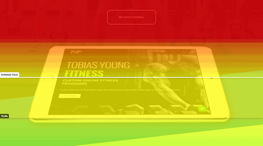
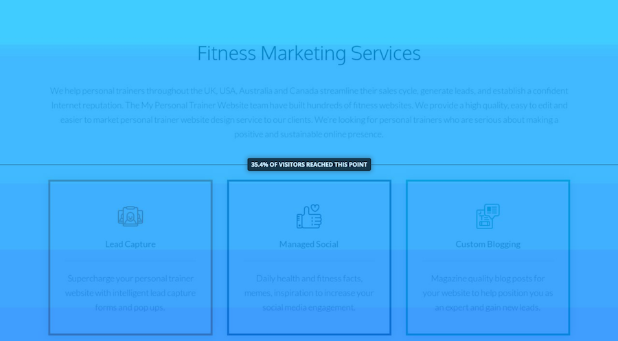
Heat maps show the sections of the page that visitors actually read and the areas that they didn’t pay much attention to. Sections in red are most-read, green is medium activity and blue stands for unseen and ignored content.
Content length
Heat maps show the sections of the page that visitors actually read and the areas that they didn’t pay much attention to. Sections in red are most-read, green is medium activity and blue stands for unseen and ignored content.
As an example, the first section of the website people see (above the fold) gets a lot "heat". Whereas the bottom gets less. We used the heat map to find out just how far people will scroll and adjusted the length of our content accordingly.
Keyword usage
A cardinal rule of SEO is to never stuff too many keywords into your copy. If you do, you run the risk of being penalized by search engines. Keywords which pop-up unwantedly in every sentence may force the reader to drop the article and exit the site. Heat maps are excellent to learn if you’ve been using a specific keyword too many times and if this keyword is ruining the reading experience of your visitor.
Heat maps also help you identify if you’ve used the wrong keyword in the copy, which is turning people off. On your fitness website, use common and most-searched keywords like ‘gym’, ‘personal trainer’, ‘cardio workout’ and ‘weight loss’ just 1-2 times, to improve the keyword search of your page.
Heat Maps and Website Design
When it comes to website design, heat maps are great tools to understand website navigation and element placement.
Which pages does the visitor visit first? What path does he take to reach this page? Does he use any internal links to visit specific pages? Why isn’t he using a particular button/CTA/link? These are some questions that heat maps help answer.
Which pages does the visitor visit first? What path does he take to reach this page? Does he use any internal links to visit specific pages? Why isn’t he using a particular button/CTA/link? These are some questions that heat maps help answer.
Internal linking
Often, the least thought out elements of a website are the internal links – links which lead to other pages within the website. Internal links also include the buttons or the calls to action (E.g "Click here").
A heat map will show how often visitors use a particular link, which links they don’t use at all and why. If the internal links are in the blue areas of the map, chances are your visitors aren’t aware that a link/CTA is present there. This can help you make changes to website design and content length/structure to make your links more visible.
Always as a rule, link to at least 2 internal pages on each page. The contact page should remain a common link in all pages and the remaining link can link back to any relevant service page. Add internal links higher-up on the page, where you know visitors will see them.
Image placement
Research by Xerox shows that website visitors are 80% more likely to continue browsing through a site if the website has colourful images in the header. Heat maps show you whether the images you’ve used on your site are being viewed or not. They also tell you whether you need to add an image/video in a highly-visible area (where there wasn’t one), to increase chances of engagement and improve readership.
The most viewed parts of the page are the top half and the left-hand sections, typically in an F-shape.
We used heat map data to get more eyes on our pricing page. We added an extra image that could be partially seen when the page loaded. To see the whole image, the visitor had to scroll down, increasing their chances of viewing our web design pricing.
If any of the elements on your web page are in green or blue, it is an indication that the visitor isn’t viewing or using those elements. You can use this information to re-arrange the text blocks, images and buttons on the page.
As a rule of thumb, use a heat map once every 2 weeks to understand what design works and what doesn’t in your website. Keep editing your site to make it more navigable and user-friendly.
Popular Heat Map Plugins
Some of the best heat map plugins that you could use are:
They're all pretty similar in the way they work. Whether or not you think you have enough visitors to use heat mapping software, I'd recommend using a free one like Hotjar to get some data anyway.
You can add the script to your website pretty easily, set it and forget it. Just don't get lost in the data or hooked on checking back every day.

