Your brand is the identity of your personal training business. Once you have a clear vision of your design elements which are recognisable immediately by your personal training clients and your prospects, you have created a brand identity which will be associated with your personal training business.
This is a hugely powerful marketing tool. There are lots of things which go into creating a brand identity, but we’re going to focus on colours, fonts, and your logo.
1. Choosing A Colour Palette That Attracts Your Ideal Client
A colour palette is a selection of no more than four colours which you use in your branding. It will be used everywhere, from your website to the content you post on social media, so take time to choose colours carefully.
Before selecting your colours, consider the personal training clients you serve in your marketplace. Your brand identity should be recognisably you, but it should be noticed and thought of as something that your clients align with too.
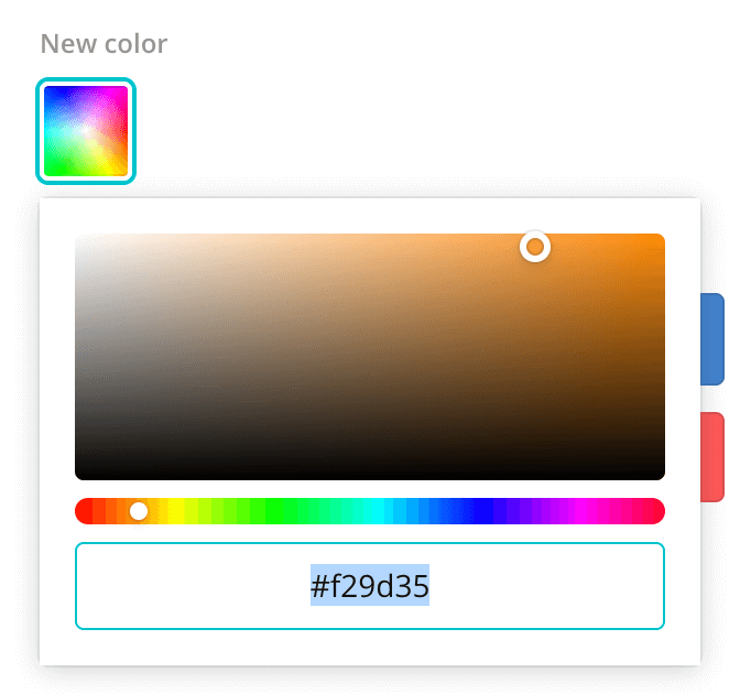
Select a palette which works cohesively together, colours which complement each other. If you struggle to come up with some colours, find an image that you feel represents you and your business and let Canva choose the colours for you.
All colours represented on a computer come with a hex code which you can see under each colour there. You can use this code so that your colours are the same everywhere. Write these codes down so you can replicate them.
Not sure where to find the hex code from an existing image? You can use a Chrome extension called ColorPick Eyedropper to hover over the colour and it will give you an exact hex code. Canva does a similar thing.
2. Choose A Title Font That Grabs Attention
The title will always be read first and will influence whether your prospect reads the rest of what you have written. This is true whether that’s an article on your blog or an infographic on your social media, so choose a title font which is clear and easy to read.
Whatever font you choose, the goal will be readability even at a glance so avoid anything which is stylistically difficult to make out.
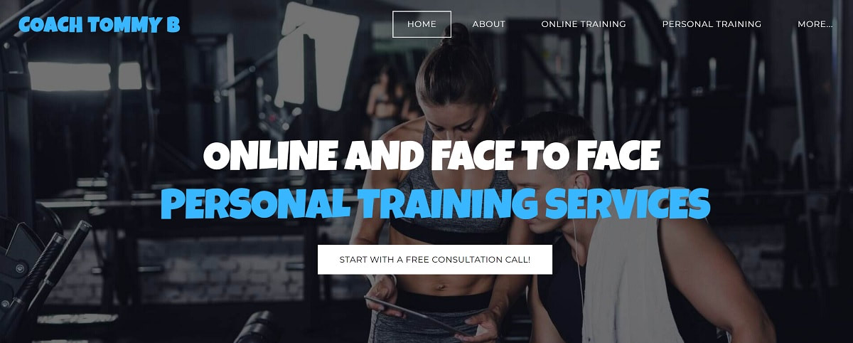
Each font gives the brand a different feel. Client, Coach Tommy B, wanted a font that said friendly, not too serious but also means business.
Whatever font you choose, the goal will be readability even at a glance so avoid anything which is stylistically difficult to make out.
Each font gives the brand a different feel. Client, Coach Tommy B, wanted a font that said friendly, not too serious but also means business.
A good rule of thumb is if you’re using a sans serif font in the body text, use a serif font in the title - and vice versa. Serifs are the little flourishes on the text - like you might have in Times New Roman, but not in Arial.
3. Choose An Easy To Read Body Text Font
The body font is what you’ll be writing in for the bulk of your written work. It should be easy to read, and clear - even on a small screen.
You’ll find your own style that works for you and your brand but the key element to branding which is consistent across all your platforms is to be consistent with whatever you choose.
If you download a font, you must make sure that it’s either purchased legitimately from Creative Market or 100% free for commercial use.
4. Create A Navigation Menu Ready Logo
Your logo is one of the most recognisable elements of your brand, and you will probably take a lot of care having one designed.
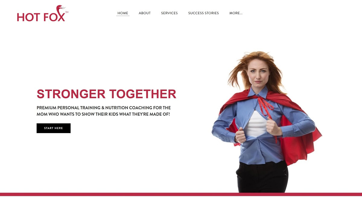
Once your personal trainer website is ready, you may want to display a logo in the navigation menu, so making one which is short and wide enough to fit in the header of the website is a must. Having an idea of the dimensions of the header before you begin will allow you to make a logo which fits the navigation bar without pushing the other elements of your page too low.
Once your personal trainer website is ready, you may want to display a logo in the navigation menu, so making one which is short and wide enough to fit in the header of the website is a must. Having an idea of the dimensions of the header before you begin will allow you to make a logo which fits the navigation bar without pushing the other elements of your page too low.
If you intend to use your logo on clothing for your personal training clients, consider a simple colour palette in the logo so that it can be easily embroidered or screen printed onto gym kit.
5. Use White Space To Make Elements Pop
White space refers to the space around the logo, or the fonts. It’s the gaps in between elements that you’re using to brand your business. The space itself is important because it means that your branding is eye catching, easy to read, and neatly presented. If you intend to write a tagline for your brand, it would probably go in this white space area.
Your branding will be used everywhere your business has a presence - social media, websites, marketing materials, business cards and stationery. Taking time to design something which appeals to you, your personal training business and values as well as your target demographic will be important in the long term success of your business.
It’s much easier to stand out online and make an impression on your clients if your branding and social media assets are consistent across all your platforms.

