Your fitness website is a great source for generating leads when designed with purpose and traffic is directed to it. By incorporating the right elements, you can encourage website visitors and users to get in touch when they need more information.
Depending on where your readers are on their buyer journey, they may just want to get through to you quickly to find out more about your services, or are ready to commit and register for a consultation.
A well designed and placed contact form will help you capture the right data for each type of visitor so you can use your email marketing strategy in future to target them with value content that is relevant to their needs.
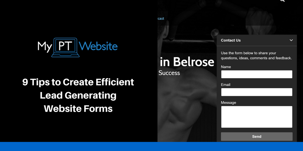
A contact form can be a very powerful tool, not just in lead generation, but also in customer profiling, prospect conversion and client management. There are three fundamental rules we suggest you follow when setting up your contact forms:
Rule 1: Keep the form short and sharp.
Long forms are very annoying and you don’t want to lose customers mid-way. Create your form just the right length to fit the purpose and avoid asking unnecessary questions.
Rule 2: Use fonts and colors that are easy-to-read.
The best colors for contact forms are black/white backgrounds with simple white/black text. Fonts can be Lucida Grande and Tahoma. If the form is on a mobile device, Sans-serif works well. Font size can be 14-16. Also make sure it matches the general theme font of your website.
Rule 3: Always mobile optimize.
According to StatCounter, the mobile internet usage exceeded the desktop internet usage in November 2016.
A well designed and placed contact form will help you capture the right data for each type of visitor so you can use your email marketing strategy in future to target them with value content that is relevant to their needs.
A contact form can be a very powerful tool, not just in lead generation, but also in customer profiling, prospect conversion and client management. There are three fundamental rules we suggest you follow when setting up your contact forms:
Rule 1: Keep the form short and sharp.
Long forms are very annoying and you don’t want to lose customers mid-way. Create your form just the right length to fit the purpose and avoid asking unnecessary questions.
Rule 2: Use fonts and colors that are easy-to-read.
The best colors for contact forms are black/white backgrounds with simple white/black text. Fonts can be Lucida Grande and Tahoma. If the form is on a mobile device, Sans-serif works well. Font size can be 14-16. Also make sure it matches the general theme font of your website.
Rule 3: Always mobile optimize.
According to StatCounter, the mobile internet usage exceeded the desktop internet usage in November 2016.
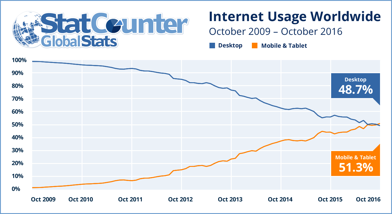
Reports suggest that 60% of all internet connections are made via mobile devices now and are expected to rise up to 90% by 2022 according to CNET.
This means, most of your prospects will be visiting your website from their phones. It is imperative that you optimize your contact forms for mobile devices to cash in on this trend.
Now that we clarified the foundations, here are 10 easy tips to make sure your contact forms convert like a machine.
1. Write a Clear Form Title
Your contact form title is the defining element that will determine whether a prospect will even consider to fill the form or not.
Using a concise contact form title can encourage your readers to take the next step and get in touch to find answers to their questions, access a free resource or request a consultation.
Using a concise contact form title can encourage your readers to take the next step and get in touch to find answers to their questions, access a free resource or request a consultation.
- Example lead magnet form: "Access Your Free Download"
- Example contact form: "Get in Touch"
- Example support form: "Get Answers"
2. Draft a Concise and Informative Description
Your prospects need to understand the purpose of the contact form that’s been displayed to them. Otherwise, the chances of their filling the form are limited. Include a short summary of how they will benefit from filling and submitting the form.
You can also hyperlink your Privacy Policy in the description, to assure prospects that their personal information is safe in your hands.
Example: "Fill out the form and submit your details to gain access to your [TITLE] free guide and regular weekly blog updates. Check how we treat your personal data [hyperlink to Privacy Policy page]."

My PT Website Client Michelle Rycroft customized her forms to include her brand color when a reader downloads her eBook.
3. Label Alignment Matters
Most cultures in the world read from left to right. Keeping User Experience in mind, for ease of use it can be important to align all the field labels and headings to the left-hand side.
Center alignment can be used for the form title however. Since the form fields are normally left-aligned, best is to keep the labels to the left too.
Center alignment can be used for the form title however. Since the form fields are normally left-aligned, best is to keep the labels to the left too.
4. Assist Visitors in Filling the Form with Tips
The worst thing a prospect can experience when filling a contact form, is not knowing how to input information. A great way to solve this problem is to make your contact form interactive and helpful.
Include informative help or examples of the kind of answer that’s expected in a specific field. Ensure your questions are clear.
Include informative help or examples of the kind of answer that’s expected in a specific field. Ensure your questions are clear.
5. Highlight the Difference Between Mandatory and Optional Fields
There are two types of information you may ask on a form. The info that's crucial for you to be able to process the request, like name, email, sometimes phone number and a few more details depending on the purpose of the form will be classed as mandatory.
Marking them as such when building the form will ensure the website visitor won't be able to submit the form without giving you that information.
Then there's the info that is not too intrusive but can help you identify who you are talking to and give them tailored advice in the future. Let the prospects decide whether they provide you with that info, but you can let them know why it would be helpful.
The questionnaire below is the first form we send to our new Managed Website clients to learn more about their business, their current website if they have one and their brand vision so we can create a framework before digging into copy writing.
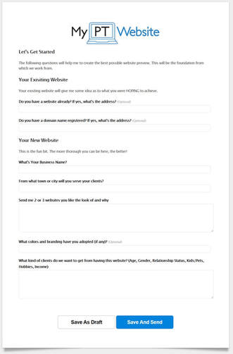
Keep in mind what the purpose of the form is and try not to add unnecessary questions. That can make the form too long so the reader might get bored before hitting the 'send' button.
Keep in mind what the purpose of the form is and try not to add unnecessary questions. That can make the form too long so the reader might get bored before hitting the 'send' button.
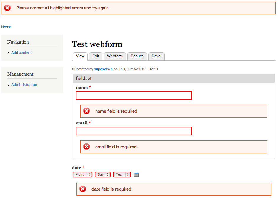
6. Bring Errors to Visitors’ Notice Immediately
To make an error is human and your prospects may make mistakes while entering information in the contact form. It’s important to help draw their attention to these mistakes quickly, to ease the form-filling process.
Most form builders will have a filter or a feature to include an error check when the prospect submits the details and best is to ensure they see the error with a different colour, ideally at the top of the form so they can rectify it. When they try to submit a form multiple times but it doesn't tell them clearly what the problem is, eventually people will stop trying.
Most form builders will have a filter or a feature to include an error check when the prospect submits the details and best is to ensure they see the error with a different colour, ideally at the top of the form so they can rectify it. When they try to submit a form multiple times but it doesn't tell them clearly what the problem is, eventually people will stop trying.
7. Avoid Crowded Drop-Down Options
Studies shows that people who are provided with numerous alternatives experience a higher cognitive dissonance and are more likely to be dissatisfied with their choice or even experience "analysis paralysis" and won't make a decision at all.
A drop-down menu with too many options can be confusing. Avoid troubling prospects with too many options. It can also create problems for you, when it comes to customer profile development. Stick to a few options and make the drop-down easy to fill.
A drop-down menu with too many options can be confusing. Avoid troubling prospects with too many options. It can also create problems for you, when it comes to customer profile development. Stick to a few options and make the drop-down easy to fill.
8. Implement a simple CAPTCHA test
A CAPTCHA test that involves confusing and illegible figures can annoy and discourage even the most persistent prospect. If your customers fail the CAPTCHA test 2-3 times, chances are they’ll exit your website without contacting you. Implement a simple CAPTCHA test which can be completed within seconds.
9. Send a Personalized Message After the Submission
These days, there are many lead management tools like Leadformly and Qualaroo that allow you to create simple and unobtrusive contact forms and surveys which can be used to capture prospect information.
You can use the collated information to send a personalized message thanking prospects for their participation and assuring them that the information they’ve provided is confidential. You can also tell them a deadline by when they can expect you to get back to them.
Furthermore, if you are using a campaign software like Campaign Monitor or Active Campaign, you will be able to create autoresponders, so whenever someone signs up to your newsletter or downloads a free resource, the system would send them a welcome message.