

One of the most crucial elements to consider when building your personal training website is typography, particularly your site’s fonts.
You want to balance visual impact and variability to make your website’s content eye-catching, easily readable, and engaging, all while maintaining professionalism and approachability. But with so many font options available, how do you know which fonts work best for your site?
This guide discusses the 10 best fonts for websites and shows you how to approach font selection so you can choose the right font to match your personal training brand’s identity.
10 Best Fonts For Web Design
Before we delve into the best fonts to consider when creating your personal training website, let’s discuss the classification of fonts. Understanding this will make selecting fonts for your website straightforward.
All types of fonts for web design fall into four primary categories:
Serif fonts: A serif is a slight projection at the end of the strokes in a letter. All serif fonts include this small line or projection on their letterforms. Most web designers consider serif fonts classical and elegant and associate them with print publishing. Popular examples of serif fonts include Georgia, Times New Roman, and Bodoni.
Sans-serif fonts: Unlike serif fonts, sans-serif typefaces don’t have any additional lines at the end of letters. They’re clean, modern, and usually have a neutral look. A great example is Helvetica.
Script fonts: Script fonts follow the fluid strokes of popular handwriting styles. Most are cursive, so they work best for titles only. Website visitors may find it hard to read any body text in script font, especially if the site has long-form informational content. A few examples include Lucida and Lobster.
Monospaced fonts: Compared to other fonts, monospaced typefaces are non-proportional. There is space between each letter in a word. Good examples include Source Code Pro and Courier New.
Now that you know the different categories of fonts you can work with, here are our top 10 font recommendations to help you build a successful personal training website:
1. Roboto
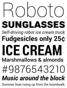
Source: Wikipedia
Because of their versatility, the Roboto font families are among the best Google fonts for web design currently. You can work with various weights, widths, and styles to create a unique modern look that makes you appear professional and accessible.
2. Open Sans
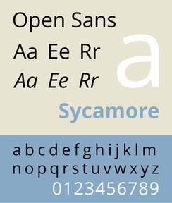
Source: Wikipedia
Open Sans is a well-known sans-serif font in web design. Its robust font library, with multiple font weights, exudes warmth and character without compromising readability. Most professionals in the healthy lifestyle and healthcare fields love this font because it brings out the brand’s values. You can position yourself as a reliable fitness trainer.
Open Sans is also one of the most mobile-friendly fonts in graphic design. It’s often the go-to font for mobile apps.
Open Sans is also one of the most mobile-friendly fonts in graphic design. It’s often the go-to font for mobile apps.
3. Source Sans Pro
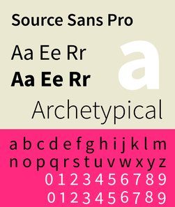
Source: Wikipedia
Another sans-serif font worth considering is Source Sans Pro. Its letterforms are clear and concise, designed to make your website copy skimmable and highly readable. This font also offers generous spacing, so your body text can stand out against images or busy background designs on web pages.
4. Libre Franklin
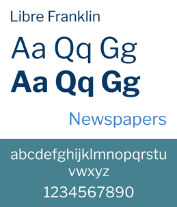
Source: Wikipedia
Libre Franklin is one of the most versatile digitally optimized web fonts. It works well on different screen sizes because of its OpenType features, like small caps and other stylistic options. Your body copy remains crisp and clear on various devices, regardless of how far readers zoom in or out.
It’s also an excellent choice for multilingual sites as it supports Latin and non-Latin languages.
It’s also an excellent choice for multilingual sites as it supports Latin and non-Latin languages.
5. Poppins
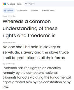
Source: fonts.google.com
Poppins is a geometric sans-serif font best for web designs that prioritize clarity, style, and excellent readability. Its geometric shapes and modern curves remain readable across all sizes and devices.
6. Playfair Display
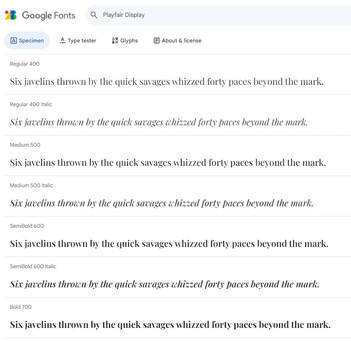
Source: fonts.google.com
If you’re looking to add a vintage feel to your site, especially the headlines and titles, Playfair Display is an excellent choice. It’s a unique, non-traditional serif typeface with gentle serifs and a classic italic style. Most people use this font as an alternative to traditional serif fonts, like Times New Roman.
7. Lato
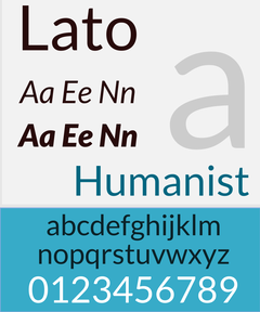
Source: Wikipedia
Lato is among the most common Google fonts on the web. It’s a sans-serif typeface, perfect for large titles and body text. Lato's rounded, classic proportions create warmth and a sense of harmony. This is the font top sites like WebMD and Merriam-Webster use to keep readers engaged.
8. Merriweather
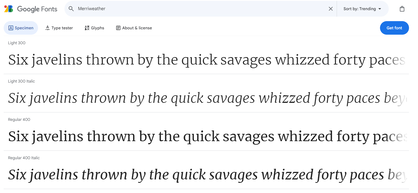
Source: fonts.google.com
Often available through Google fonts, Merriweather is a great serif font that has a natural letter weight and width, making it more relaxed than most font choices. It’s a good font for your website if you plan to have a section devoted to articles and other musings on living a healthy lifestyle.
9. Graphik
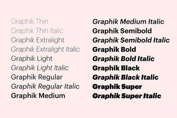
Source: befonts.com
Graphik is a classic font with clean, elegant lines and several letter widths. It not only works well for web design but also for marketing material, like newsletters and ads. Consider this font if you want to streamline your messaging across various media.
10. Metropolis
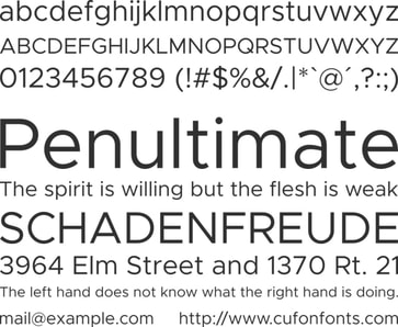
Source: cufonfonts.com
Metropolis is a dynamic, well-structured, free font with nine weights you can work with. This font is at the top of the list of web-safe fonts that can accommodate any brand identity thanks to its simplicity and flexibility.
How To Choose The Right Font For Your Personal Trainer Website
There’s no specific shortcut for choosing the best font for web design. It all boils down to your specific brand identity and needs. However, there are three steps you can follow to ensure you choose a font that amplifies your brand’s tone and provides an enjoyable user experience:
1. Define Your Mission Or Purpose As A Personal Trainer
Why do you want to create your website? What specific purpose will it serve? Answering these questions will help you identify the overall theme for your site. Then, you can look for a font with characteristics that complement your theme.
For example, if your goal is to sell your at-home weight loss video programs and equipment, you may choose a simple, elegant theme that lets your products stand out. A simple, stylish font to consider for this type of site is Graphik.
For example, if your goal is to sell your at-home weight loss video programs and equipment, you may choose a simple, elegant theme that lets your products stand out. A simple, stylish font to consider for this type of site is Graphik.
2. Evaluate Your Target Audience
Evaluating your target audience will help you further define the characteristics of the font you should use. What font or font family will your audience respond to best?
Say you intend to reach an older audience. Your best option may be strong, bold, serif, or non-serif fonts.
If you considered Graphik – a non-serif font – in step 1, you’d now narrow it down to the specific Graphik typeface your audience will resonate with.
Should you not find a bold typeface to match what your audience will respond to within this font family, you’ll know you made the wrong choice and can seek an alternative.
3. Envision The Message You’d Like To Communicate
This is where you determine the exact font size and visual weight of the font that might work well for you. You want to ensure your chosen font reinforces your tone to convey your message correctly.
Say your tone is warm, positive, and inspiring. The font and styles chosen under steps 1 and 2 should match your tone. You may have to combine different fonts from the same family to achieve the perfect tone.
At this stage, you also want to account for accessibility, i.e., ensuring your intended message will be accessible to everyone. Many web fonts, including Adobe fonts, are only accessible to a select few.
Others might be too cluttered, making it hard for users with visual challenges to read your content.
If you’re new to website creation, It’s best to go for web-safe fonts pre-installed on almost all devices. They will always load quickly and correctly. A good default font to consider is Helvetica. It’s clean and has multiple fonts with unique features spread across 22 font families.
Final Thoughts
From our 12+ years of experience helping personal trainers create successful websites, we've found that the best fonts for fitness websites are within the serif or sans-serif family.
You can pair these fonts with typefaces from the other categories to create a unique look, but remember to select fonts that complement one another. Too much contrast amongst your website fonts will make your content difficult to read. Aim for three fonts throughout your site.
The result should always be crisp and clean, so that your message pops out and is easily understandable.